Counselling Practice Website: Webflow to Next.js Rebuild: Talk Shop
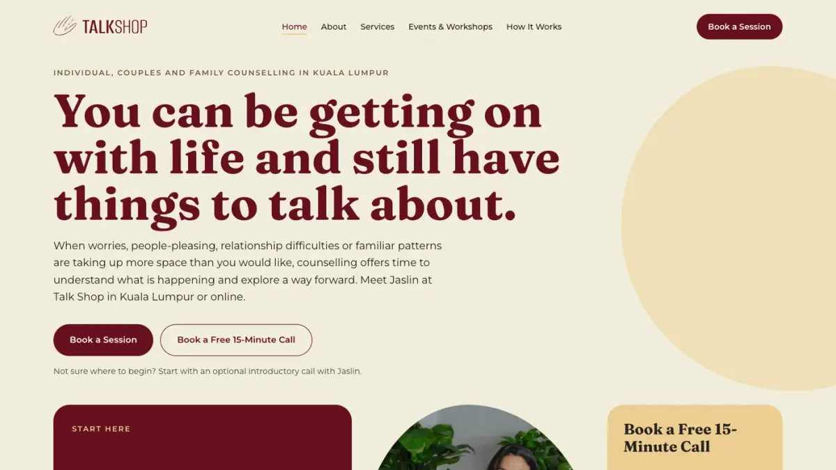
Rebuilt a Kuala Lumpur counselling practice's Webflow site in Next.js so the client owns the code. A warm, motion-led design system with calm reduced-motion-safe animation, typed content files, privacy-first analytics and SEO redirects from the old site.
- When
- Nov 2026
- Type
- Websites
- Tools
- Link
- talkshop-site.vercel.app ↗
Stack: Next.js 16 (App Router), React 19, TypeScript, Tailwind CSS v4, Motion, Vercel
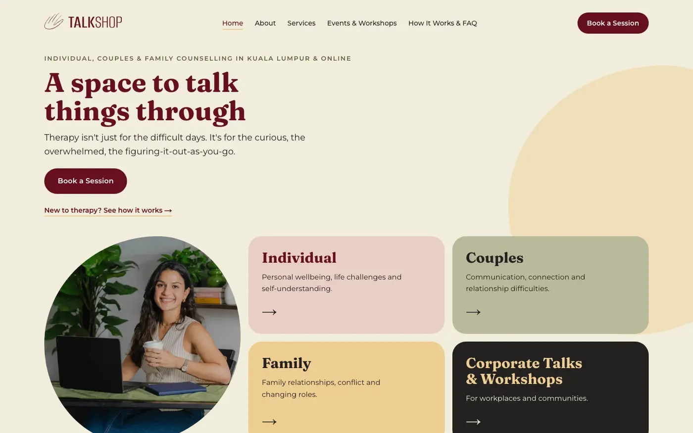
Home hero: headline, portrait and four clear ways to start
Overview
Talk Shop is the practice of Jaslin Sidhu, a registered counsellor in Kuala Lumpur who sees individuals, couples and families, and is adding corporate talks and workshops. I built her original site in Webflow. As the practice grew she needed more than a static one-pager, and a site she could fully own, so I rebuilt it in code.
Solo design and development: a brand-to-code design system, a multi-page site, SEO, analytics, a client review round and handover.
The Brief
Jaslin wanted the site to feel “a bit more flowy”. My goal: a visitor understands what she does within seconds, and knows how to book.
- A sensitive audience. People often visit a counselling site on a hard day. Motion had to feel calm, never busy, and the site had to stay fast on mobile.
- Strict content rules. No contact form, no fees, no session lengths, no room photos, and an always-visible “not an emergency service” note with crisis lines.
- Ownership. The client gets the full codebase, and anyone should be able to edit it without touching layout code.
Design Approach
I started from the existing brand (burgundy, cream, olive, gold and a hand-drawn palm logo), explored three directions, and merged two of them.
- Colour-block tile hero. A headline, a portrait in an organic blob mask, and tiles for the clear next steps: book a session, book a free 15-minute call, see how it works, or pick a service. Each of the four services has its own colour.
- Flow instead of hard cuts. Wavy dividers carry the page from cream to burgundy to olive. A ticker band, morphing blobs and a line-draw of the palm logo add movement.
- One repeatable call to action. “Book a Session” is the primary button on every page, “Book a Free 15-Minute Call” the secondary, “Ask a Question” the quiet third.
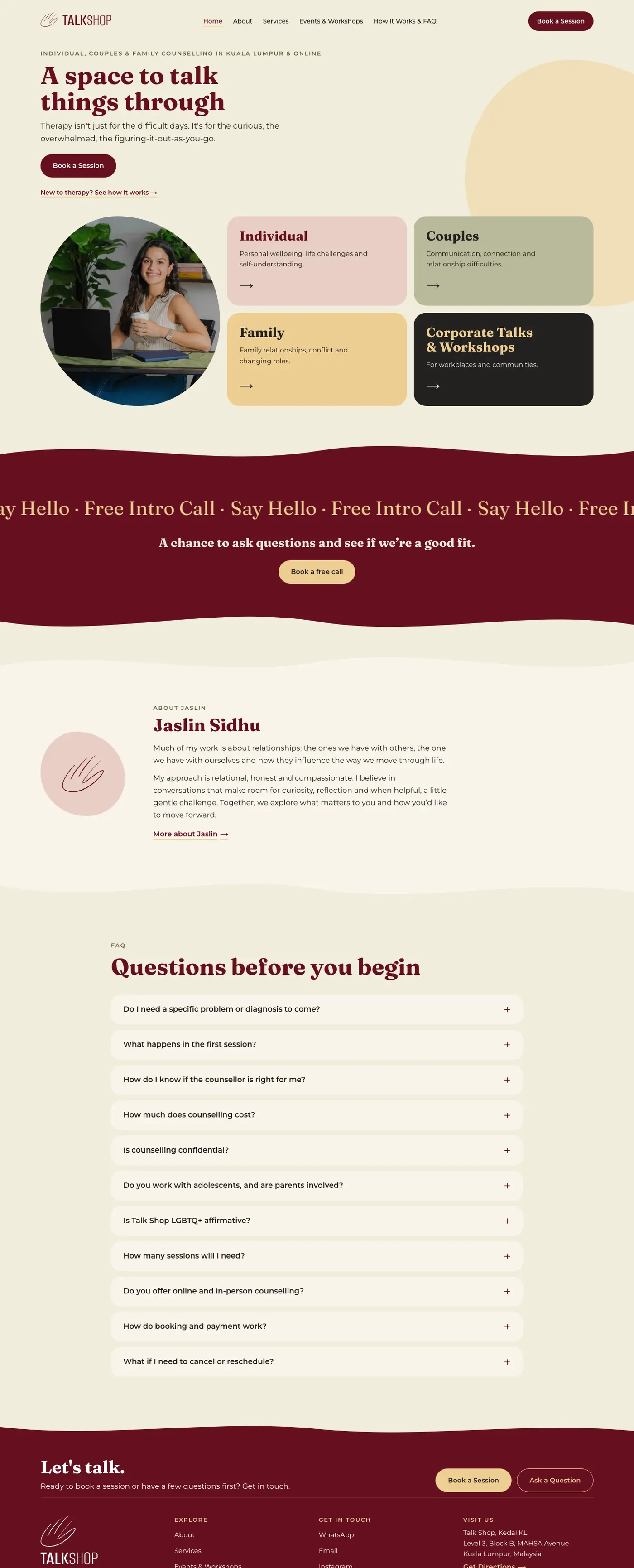
Full home page
Pages
- Home. Hero with four colour-coded tiles (Individual, Couples, Family, Corporate Talks & Workshops), a free-intro-call ticker band, a short introduction to Jaslin, the full FAQ and a closing call to action.
- About. Bio, how she works, qualifications, registration and additional training. Profiles are data-driven, so adding a second therapist is one object in a content file.
- Services. Three dedicated pages for individual, couples and family counselling, each written around the situations people arrive with.
- Corporate Talks & Workshops. Six topic tiles, three ways of working together, and a “Beyond the therapy room” showcase with a podcast appearance, a community event and corporate training, with video links that open on demand.
- How it works & FAQ. Three steps from booking to turning up as you are, followed by eleven questions people ask before starting.
- Privacy and Terms. Plain-language legal pages in the same design system.
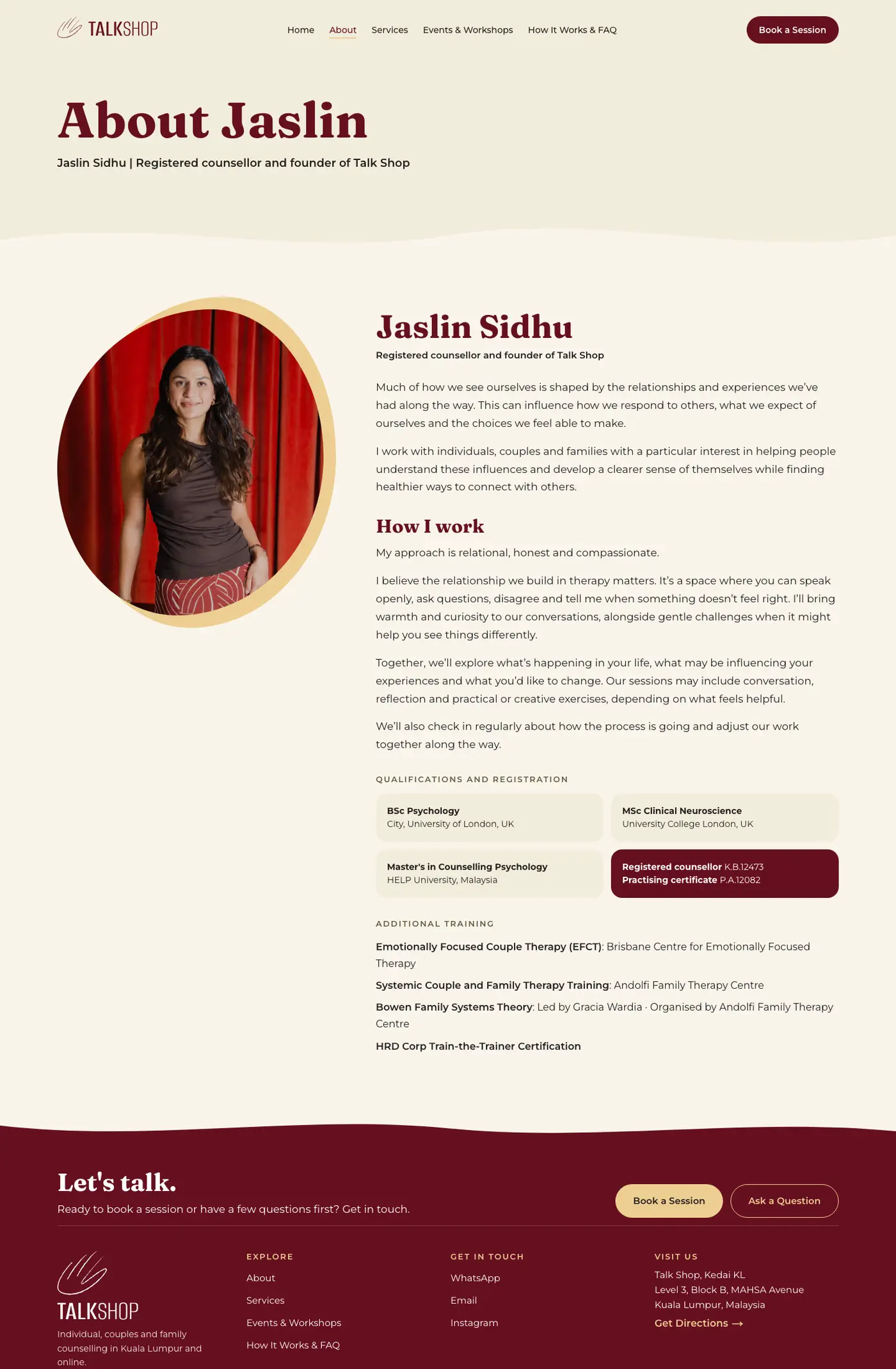
About
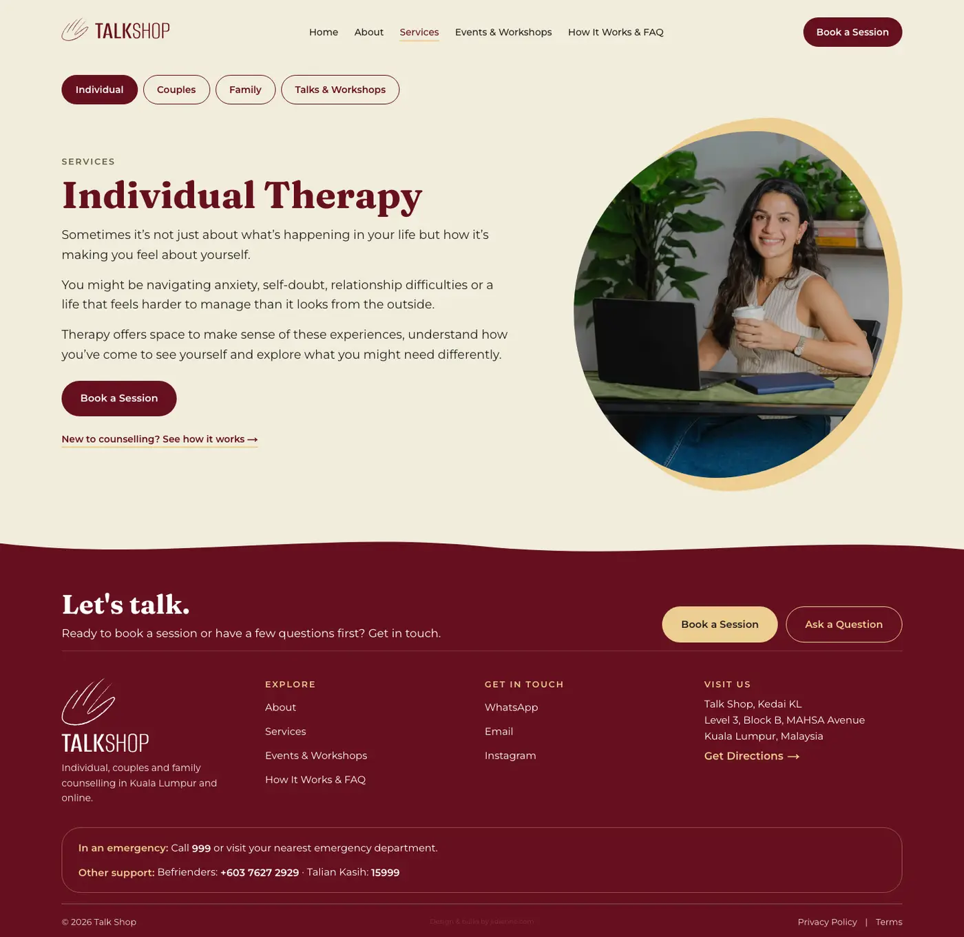
Services: one dedicated page each for individual, couples and family
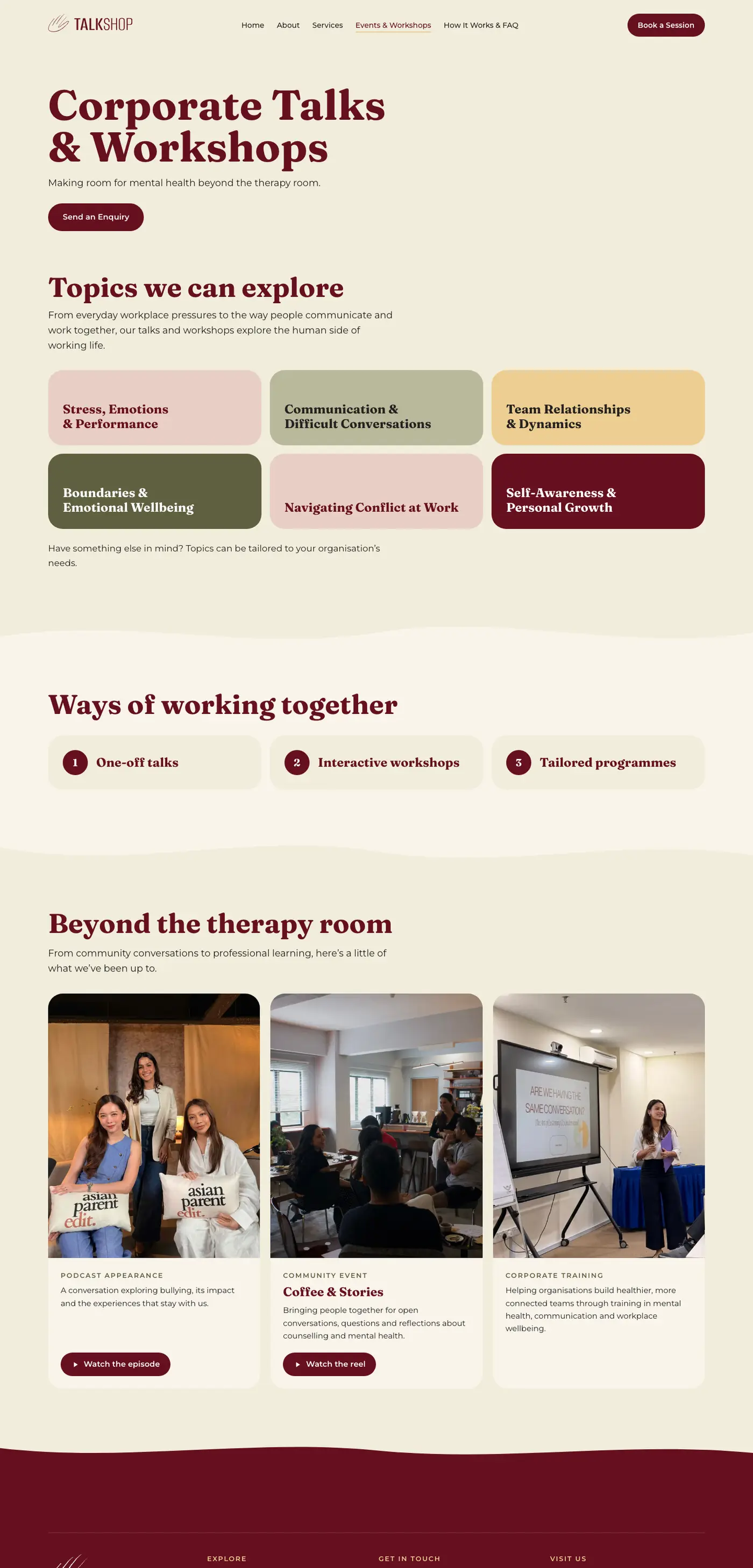
Corporate Talks & Workshops
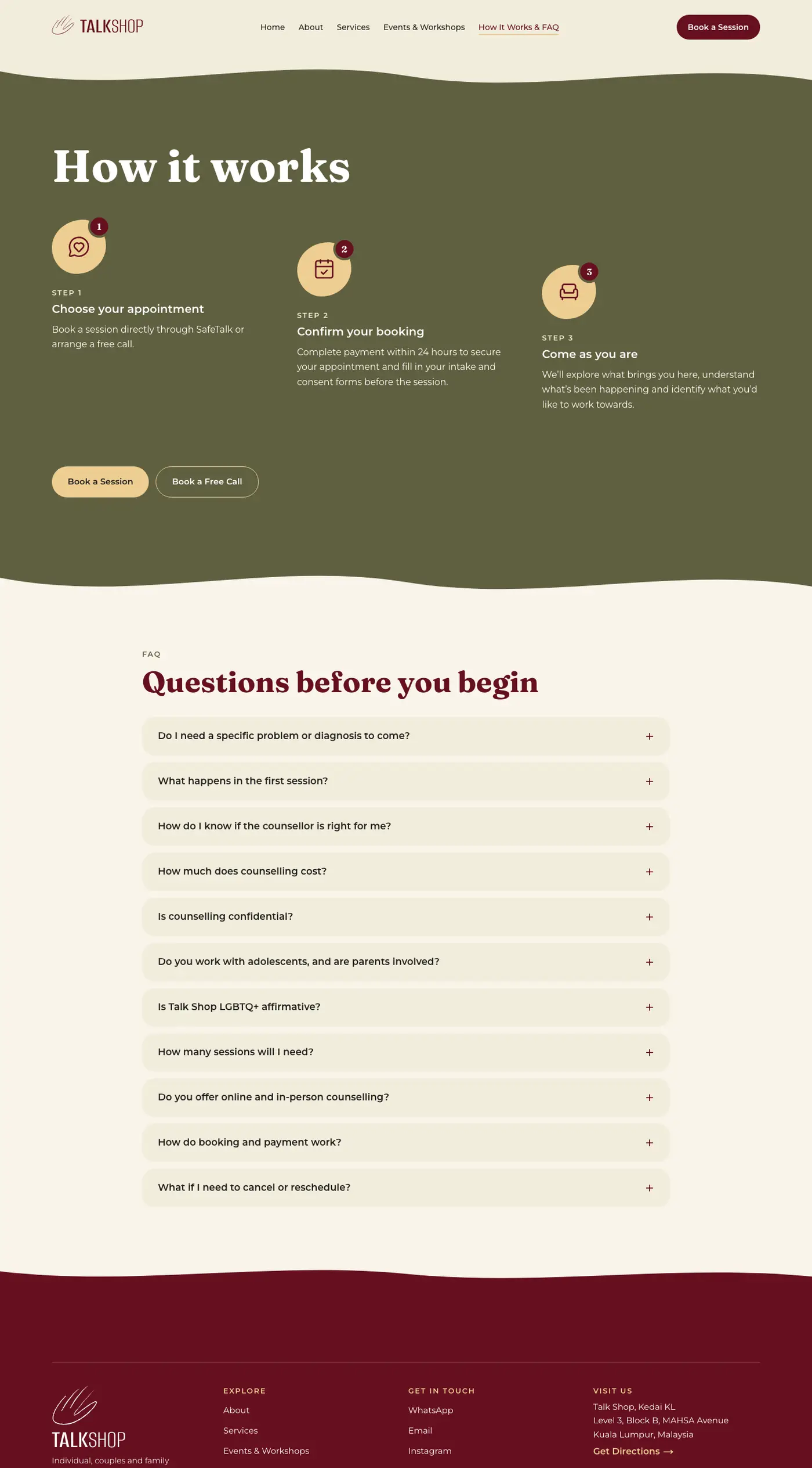
How it works & FAQ
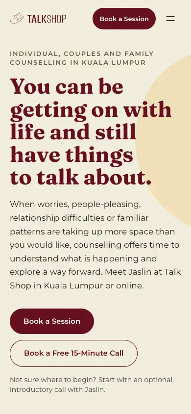
Mobile: condensed header and stacked tiles
The Build
- Motion that respects people. Blobs, ticker, logo draw, scroll reveals and page fades all stop under
prefers-reduced-motion. Nothing autoplays or flashes. - Content separated from layout. Every word and link lives in typed files under
src/content/, and the README documents how to add an event or team member step by step. - A tight token system. Tailwind’s default palette is switched off, so only brand colours compile. A hidden
/styleguideroute shows every primitive for QA. - Privacy-first. Vercel Web Analytics only: no cookies, no third-party scripts, which suits a sensitive sector.
- SEO. Per-page metadata and generated Open Graph and share images, sitemap, robots, LocalBusiness and FAQ structured data, and 301 redirects from the old Webflow anchors, followed by an audit pass for Open Graph and Twitter tags on every page.
- Accessibility. Brand colours checked for contrast, an ARIA FAQ accordion, designed-in focus states and tap targets.
- Safe to hand over. Anything still waiting on client content was flagged with a visible badge and kept out of search until it arrived. All of it has since been replaced with real copy and photography.
- Heading font isolated to one file, so swapping the trial font for a licensed one is a one-file change.
Process
- Align. A call to pin down what “flowy” meant, plus information architecture and making corporate work a first-class service.
- Assets. Pulled colour, type and logo tokens from the live site, then vectorised the palm logomark for animation.
- Design. Three directions, merged into one and signed off before any code.
- Build. Scaffold, tokens, shared components, pages, then a dedicated motion pass.
- Client review. Jaslin reviewed the build and sent copy, service and event feedback. I split services into dedicated pages, rebuilt the events page around her real talks and photos, moved the FAQ and added the legal pages.
- QA and handover. Responsive, accessibility and link checks, then repo access and notes for the client.
Status
Built and deployed to a preview URL after a full client review round. Client content, certificates and legal pages are in. The domain cutover from Webflow is the remaining step.