Event Company Website: Design System & Astro Build: Art Network
Rebuilt the website for a Malaysian event management company, 11 years after I designed their first one. Built on Bold Stage, a custom design system: a dark canvas, the brand red used like stage lighting, and their event photography doing most of the selling. Hand-built in Astro and shipped on Vercel.
- When
- Oct 2026
- Type
- Websites
- Tools
- Link
- art-network-my.vercel.app ↗
Stack: Astro, Tailwind CSS v4, Vercel, Web3Forms
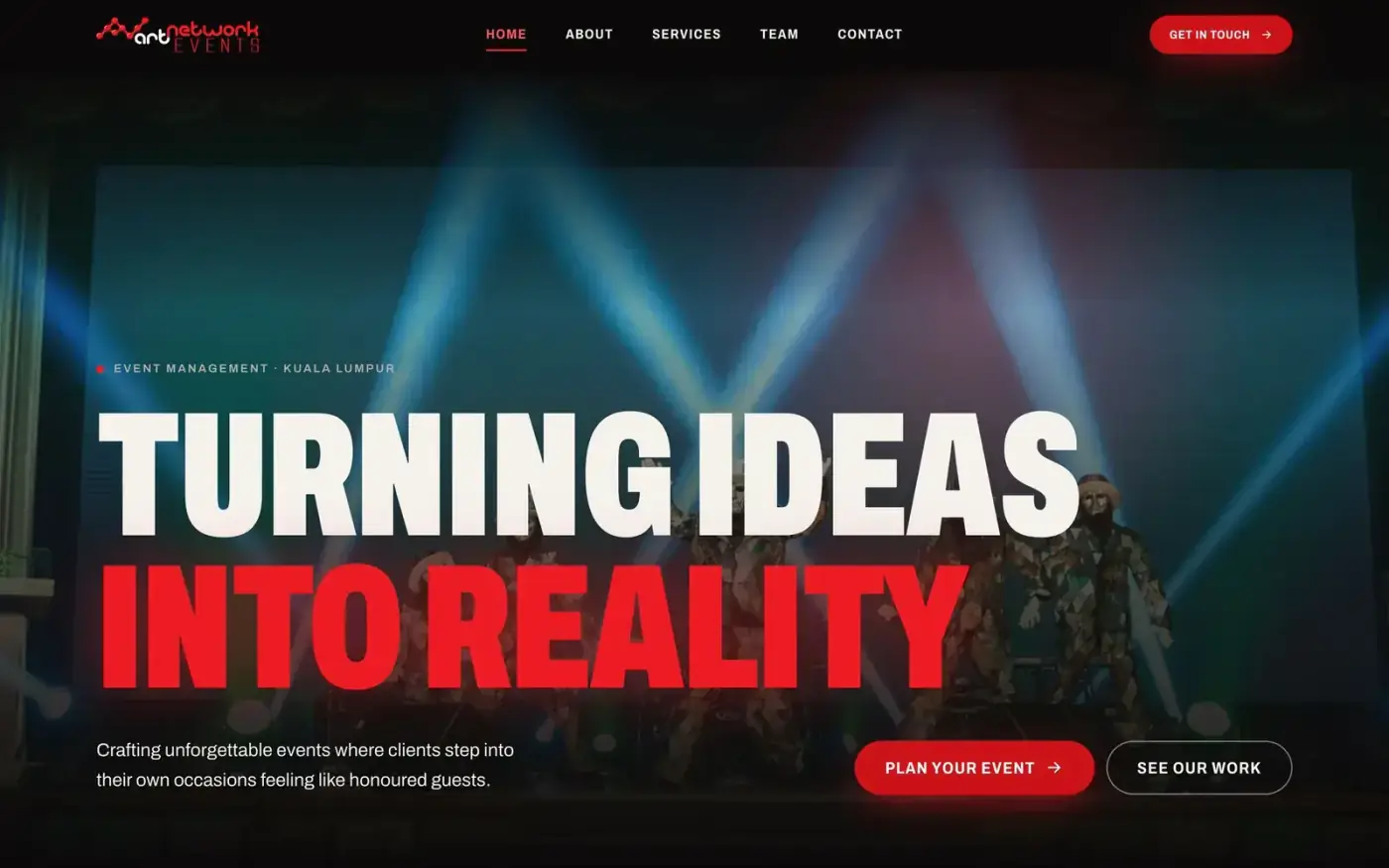
Art Network home hero: “Turning Ideas Into Reality” over a stage-lit event photo
Overview
Art Network Events is an event management company in Petaling Jaya. It was founded as a sole proprietorship in 2002 by Sherwin Nunis, who started out as an art director. They run corporate gatherings, product launches, private parties, promotional booths, audio and visual production, and talent bookings, and they organise their own outdoor festival, For’Us Fest.
I designed Art Network’s website once before, on Wix in 2015. This time the job covered everything: creative direction, a design system, the front-end build, SEO and launch, all in code.
The Problem
The first build followed the Figma hi-fi exactly, and it worked. But it looked like a template, and for an event company that’s a problem.
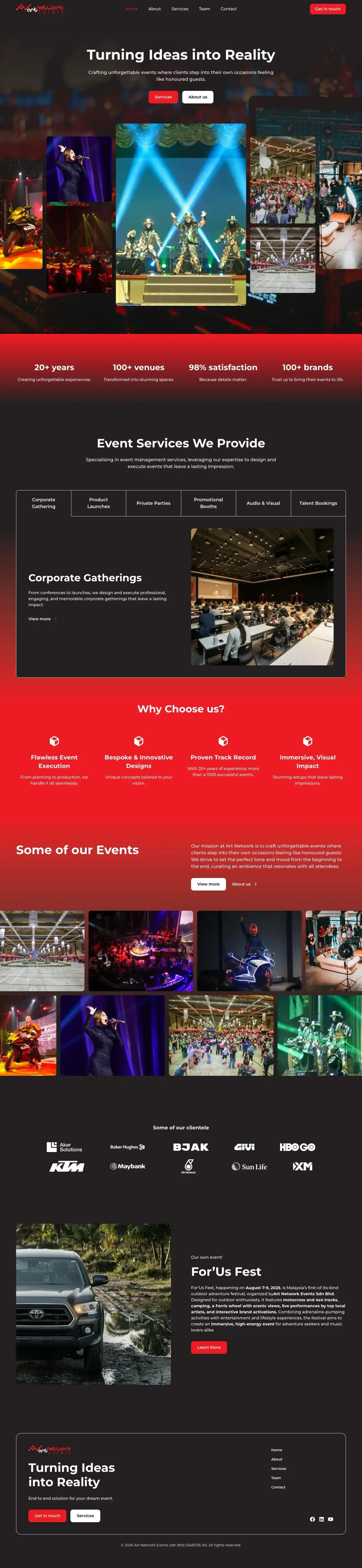
The first build, made directly from the Figma hi-fi frames
-
The red was everywhere. Full-width red bands behind the stats and “Why choose us” sections meant the brand colour was background, not emphasis. Nothing stood out because everything was loud.
-
The photos were treated like thumbnails. Their stage photography is the strongest thing they have, and it sat in small tiles and tabbed carousels.
-
The logo red failed accessibility for small text.
#ED1C24on dark backgrounds reaches 4.5:1, which is fine for big headlines but not for eyebrows, tags, form errors or white button labels. -
There was no system underneath. The design tokens were copied straight from the Figma frames (red, charcoal, a type scale), so every new section meant more one-off styling.
-
The type didn’t carry the brand. Montserrat at modest sizes read as corporate brochure, not live event.
The client sells the feeling of walking into a room that’s been staged for you. The site needed to give visitors that feeling.
My Role
-
Creative direction: prototyped three style directions with real content and picked one
-
Design system: tokens, type scale, motion rules, an 18-component UI kit, and a live
/styleguidepage -
Front-end build: every page in Astro and Tailwind, with content kept in data files so copy edits don’t touch markup
-
Performance and accessibility: Lighthouse audits, font subsetting, image pipeline, contrast tokens
-
Launch: SEO, generated social share cards, sitemap, structured data, analytics, Vercel deployment, and handover docs
I used Claude Code as a build partner throughout. I made the design calls and checked every page in the browser at desktop and 375px widths.
The Challenge
1. Use the brand red without letting it take over. The red is the brand, but as a flat fill it overwhelms everything and it can’t carry small text. I needed a way to use it a lot without it becoming wallpaper.
2. Make photos do the selling. There’s very little copy and a lot of photography. The layout had to make photos the main content, not decoration.
3. Six service lines, one clear path. Visitors need to see what Art Network does, see proof, and get in touch, without getting lost in six categories.
4. Easy to maintain later. One small company, no developer on staff. Content edits had to be easy, and the system had to stop the design from drifting over time.
Approach
Build the Figma first, then question it
I built the first version straight from the Figma desktop and mobile frames: Home, Services, About, Team and Contact, with the contact form connected to Web3Forms and Vercel hosting set up. Having it live in the browser made the problems obvious much faster than the static frames did.
Three directions, all using real content
Before rebuilding anything, I made a /directions page with three style tiles. Each used the same photos, copy and stats, so the only thing changing was the visual style.
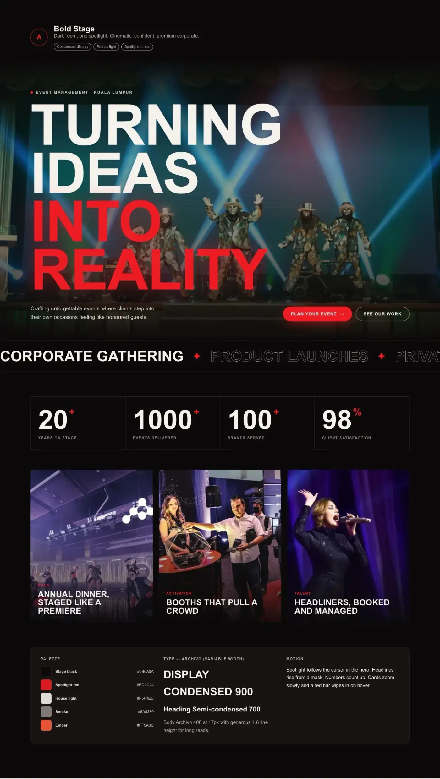
Direction A: Bold Stage. Dark room, one spotlight.
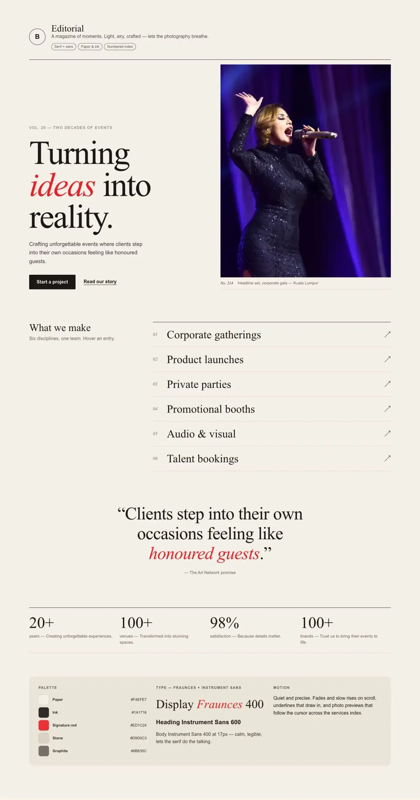
Direction B: Editorial. Light, airy, magazine-like.
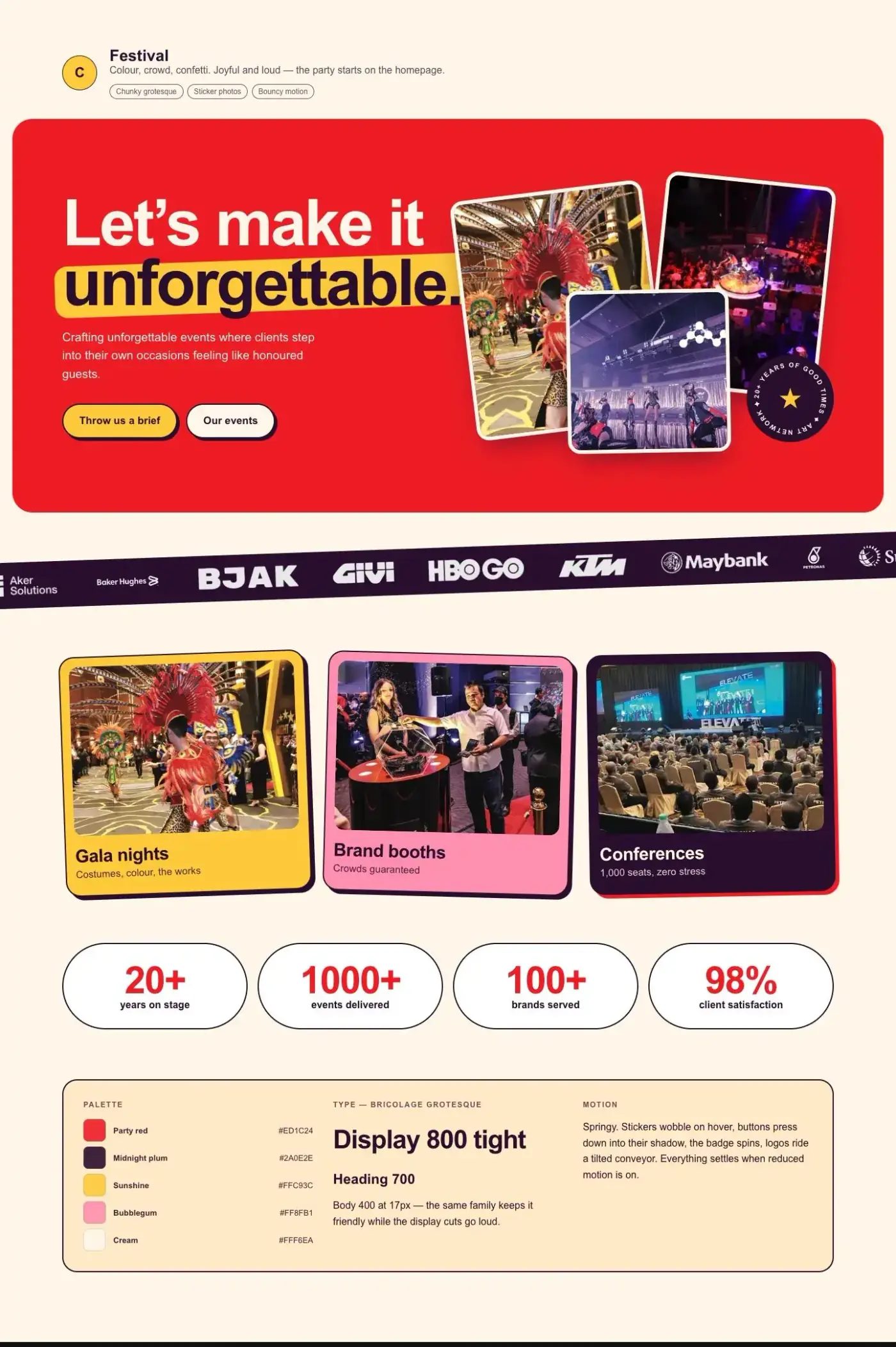
Direction C: Festival. Colourful, chunky, playful.
Bold Stage won. Corporate and brand clients make up the core of the business, and stage photography looks best on a dark background. Editorial lives on as a theme-light option, so a section can bring the house lights up without needing a second design language.
The design system came before the pages
Bold Stage is built around one idea: a dark room with one spotlight. It has four principles:
-
Red is light, not paint. Use it for the one thing that matters in each view: a call to action, a key word, a glow.
-
Photography is the set. Text sits on photos using scrims and gradients, not inside boxes.
-
Loud headlines, quiet body text. Condensed display type for the big moments, calm readable text for the details.
-
Motion with a purpose. Things rise, glow and count up, and all of it stops when a visitor has asked for reduced motion.
The tokens have three layers: primitives (red, warm stone and ember ramps), semantic tokens (canvas, surface, ink, line, accent…), and component tokens (button, card, panel and input radii). I removed Tailwind’s default palette entirely, so the only colours that work in the code are the ones the system defines.
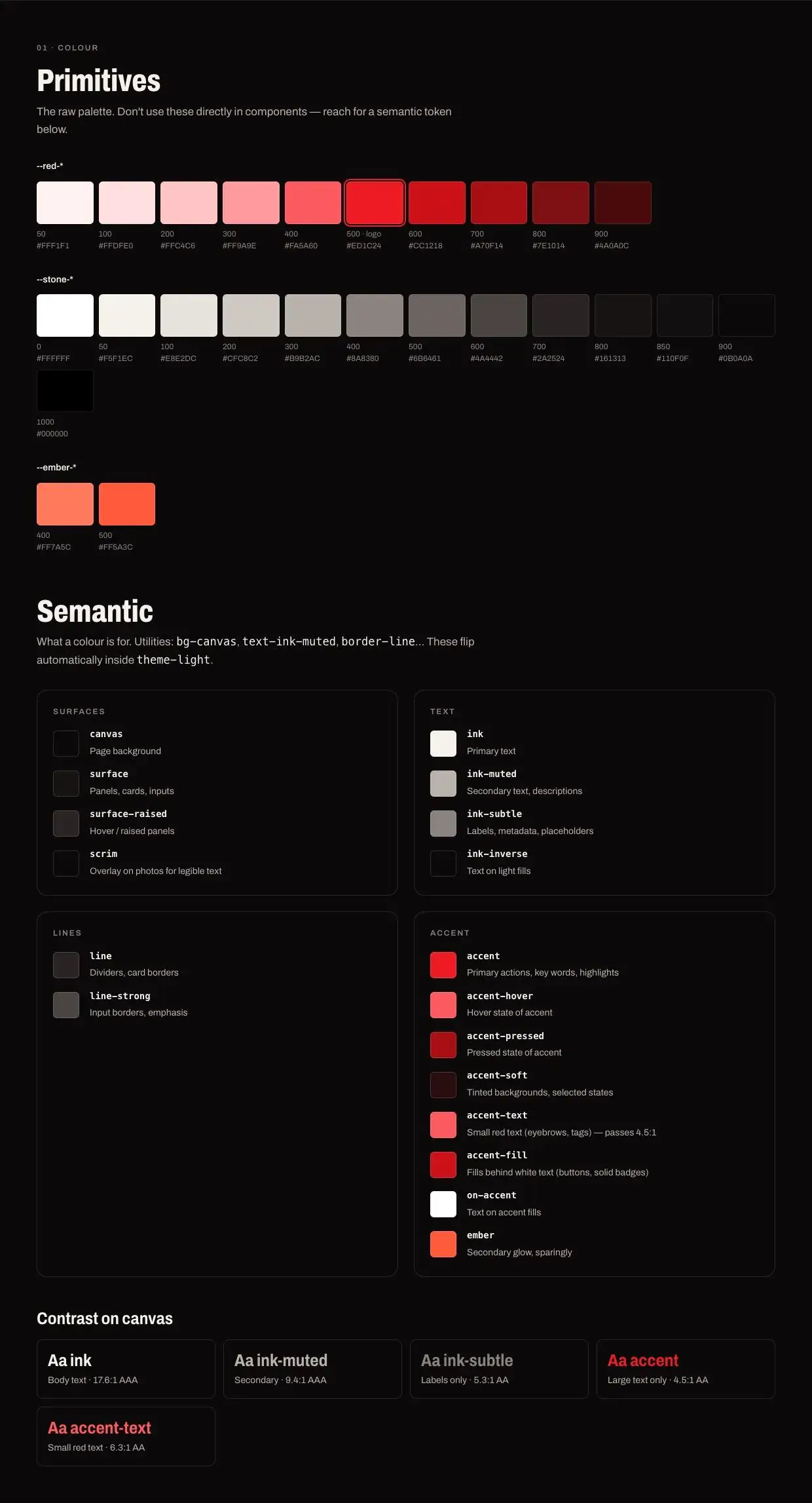
Colour tokens in the live styleguide, with contrast ratios calculated in the browser
Type is a single variable font, Archivo, used from 62% width (condensed, weight 900, uppercase) for display headlines up to normal width for body text. Every size scales smoothly between a 360px and a 1440px viewport, with no jumps at breakpoints.
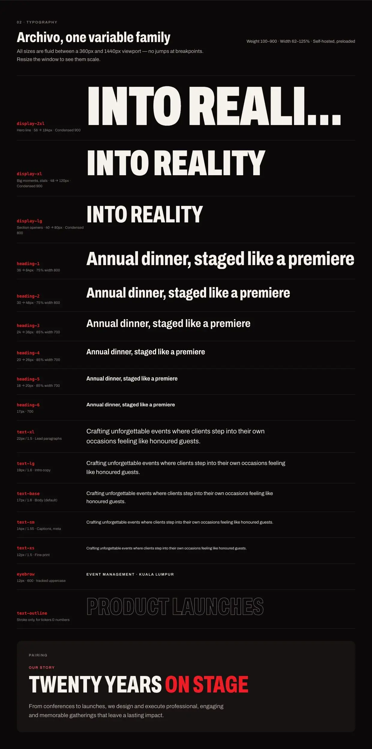
Type scale: display-2xl to body text, all fluid
Then came the component kit: 18 components including Hero, Section, EventCard, Stat, Gallery, Ticker, CtaBand and Field. Each one has a live demo and a usage snippet on /styleguide.

Component library on /styleguide
Rebuilding page by page
I rebuilt each page on the new kit, and deleted the old Figma-era components as I went so nothing could quietly hang around.

Home
-
Home: Spotlight hero, a scrolling ticker of services, stats that count up, service cards that link to their galleries, a numbered “why us” grid, an event gallery, a For’Us Fest feature, a client logo ticker and a closing call to action.
-
Services: A category bar that sticks under the header and highlights the section in view. Each category gets its own section with a masonry gallery and a lightbox, replacing the old carousels.
-
About: The founding story as a 1998 / 2002 / Today timeline, values in a numbered grid, and the mission set as a pull quote.
-
Team: Leadership in a row of three, the wider crew four across. Portraits stay muted until you hover, then switch to full colour.
-
Contact: A form in a raised panel, with new optional fields for phone, event type and event date so enquiries come in already qualified.

Services: sticky category bar and masonry galleries
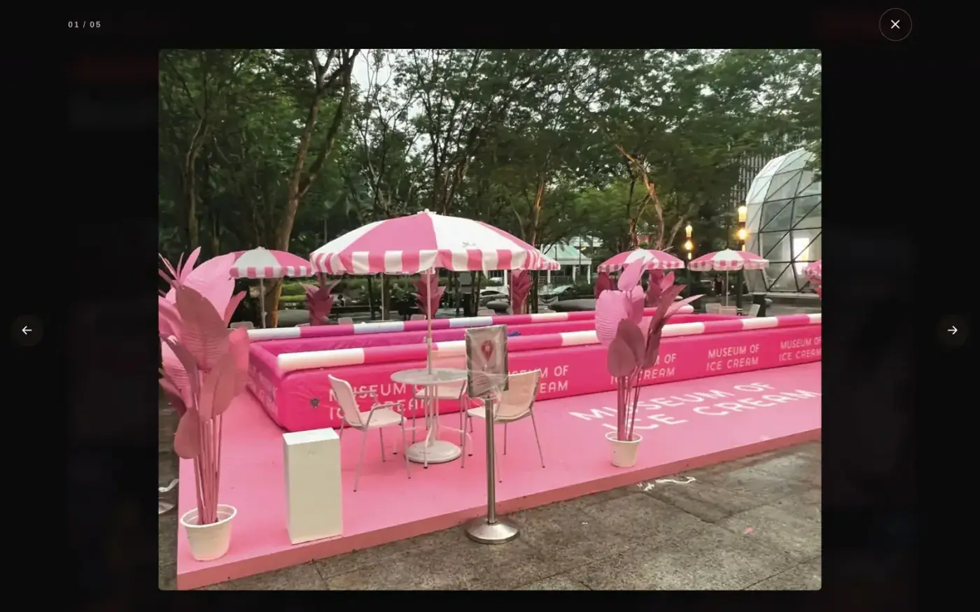
Gallery lightbox: works with arrow keys and swipe, and returns focus to the photo you came from
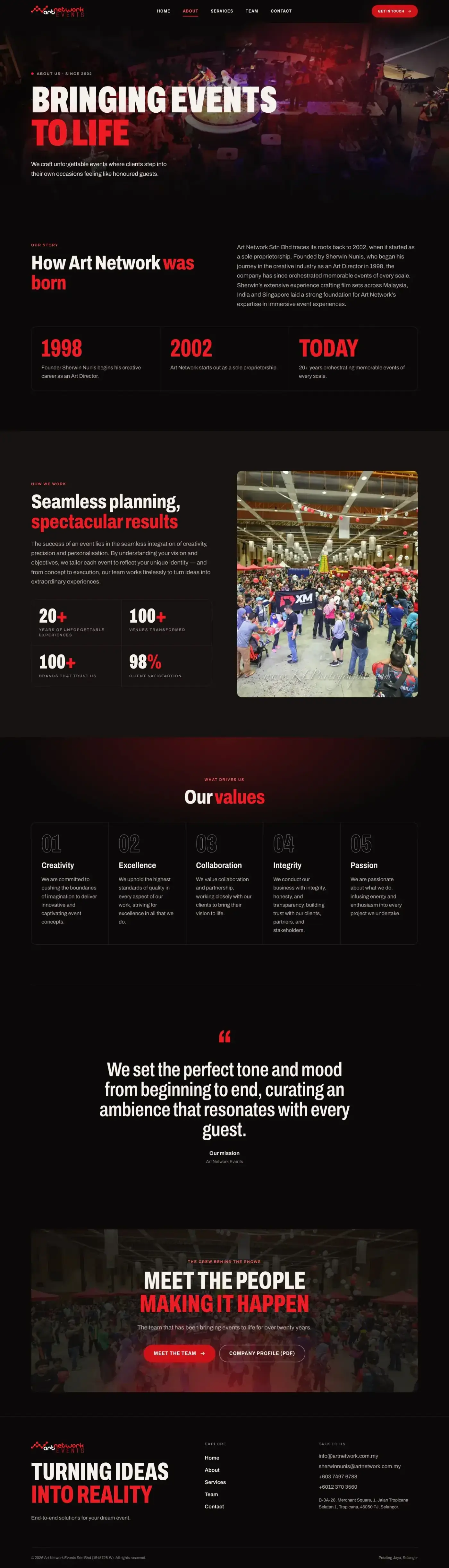
About
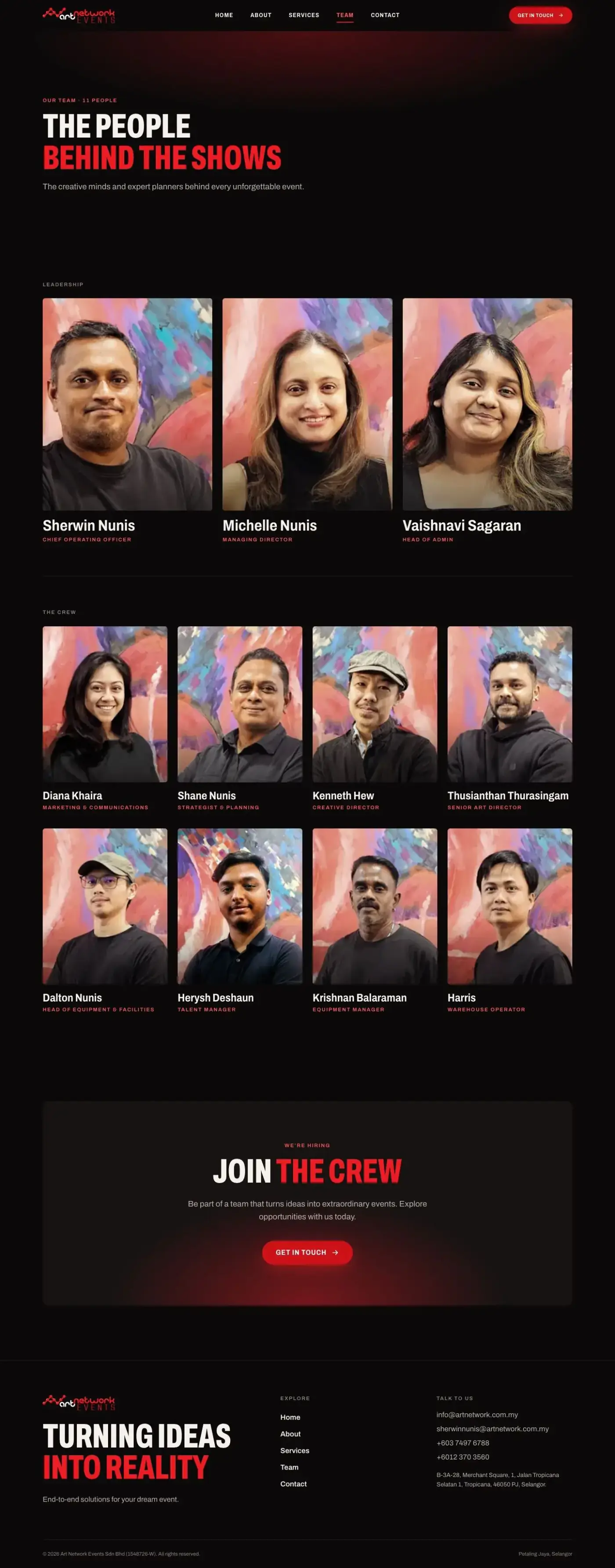
Team
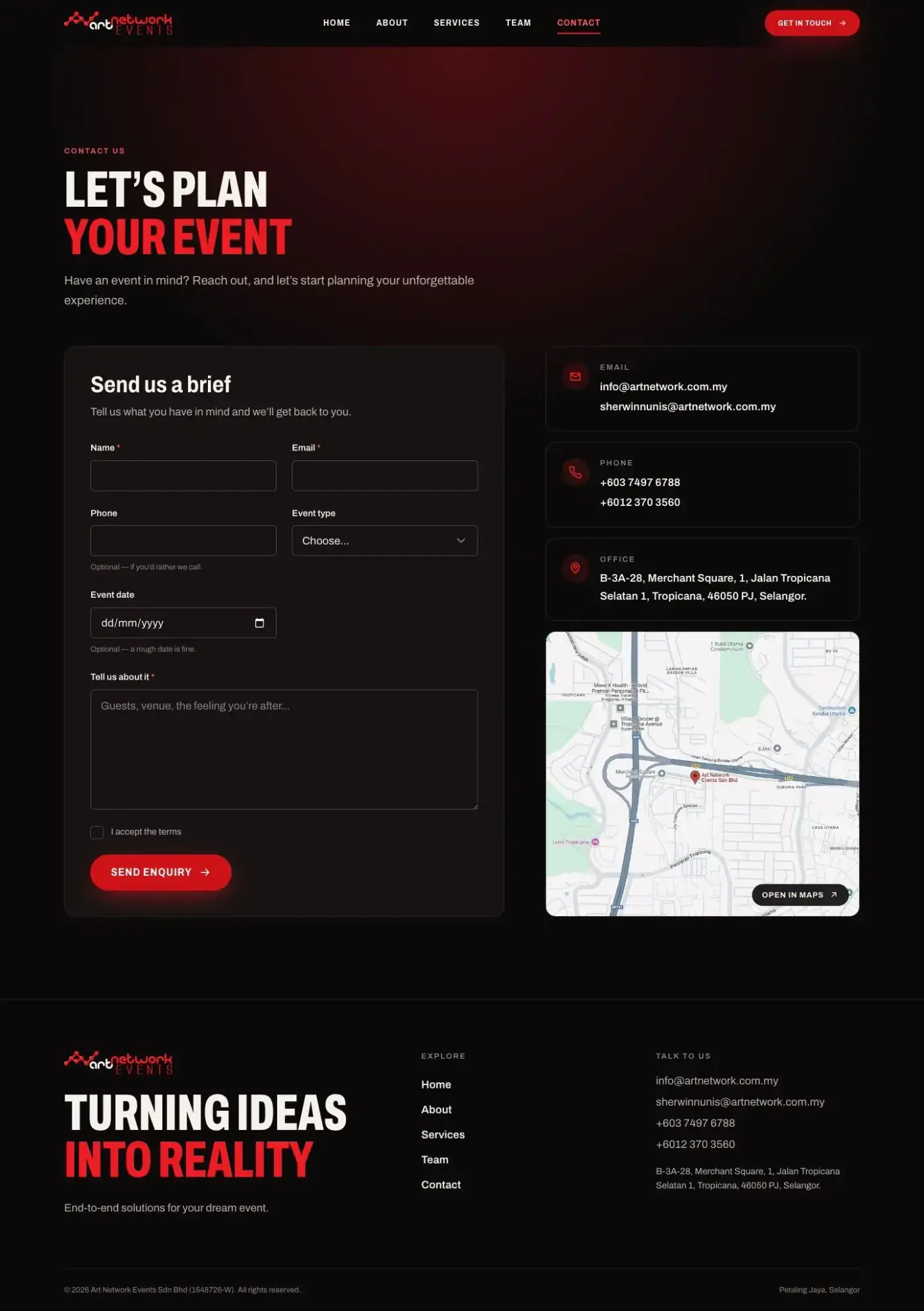
Contact
Performance and accessibility as their own phase
I gave performance and accessibility a dedicated pass rather than fixing them at the end, and measured with Lighthouse (mobile) before and after:
-
Accessibility: 95–100 → 100 on every page
-
Performance: 92–100 → 99–100
-
Largest Contentful Paint (LCP): up to 3.3s → 1.4–2.3s
-
Page weight: down 25–30%
How I got there:
-
Fonts: Self-hosted a custom Archivo subset (weights 400–900, widths 62–100%, Latin only). 52 KB instead of 90 KB.
-
Images: Re-tuned WebP compression across the site, cutting generated images from 27 MB to 18 MB. Added image sizes that match how big each one actually displays, and only the hero photo and logo load immediately on Home (it used to be eight images).
-
Contrast: Rather than changing the brand red, I added two tokens next to it.
accent-text(≥ 5.9:1) is for small red text, andaccent-fill(5.7:1 with white) is for buttons and badges. The logo red stays for large display type and glows only.
Mobile
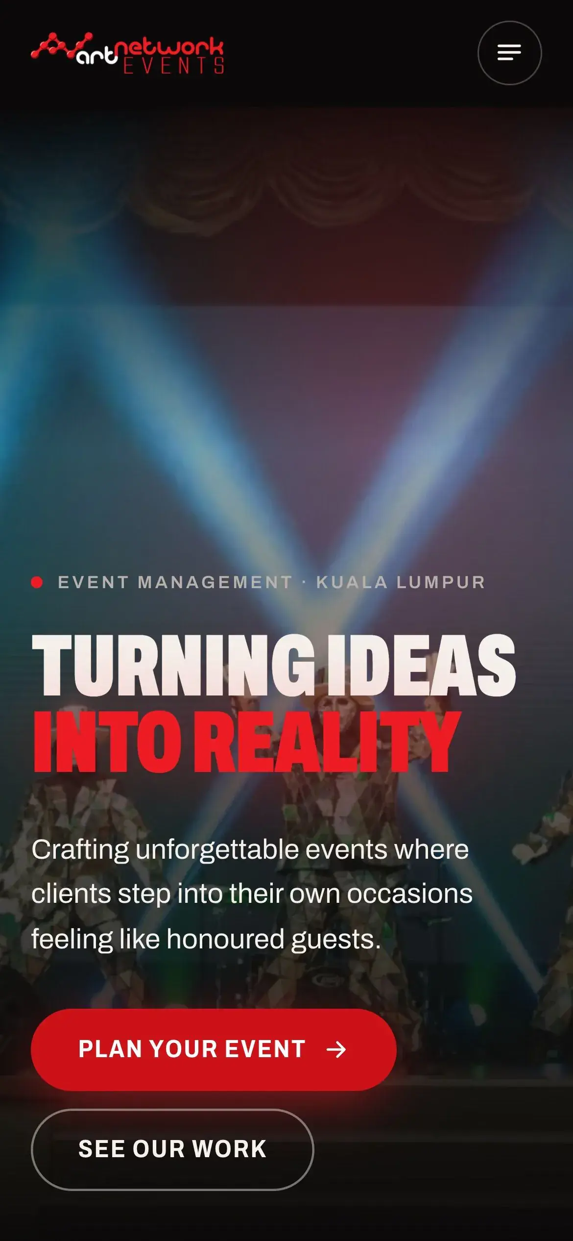
Mobile home
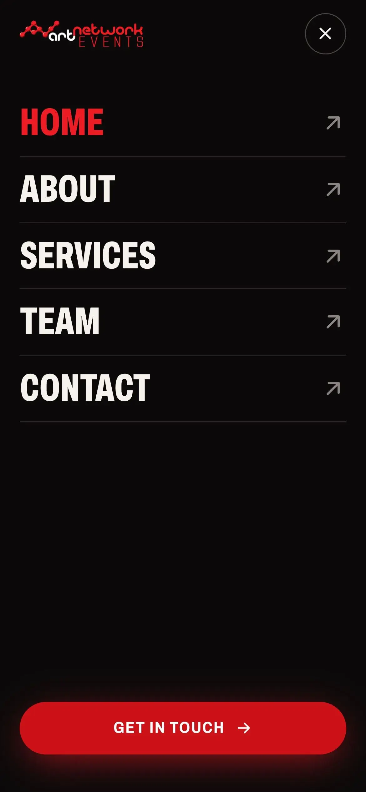
Full-screen mobile menu
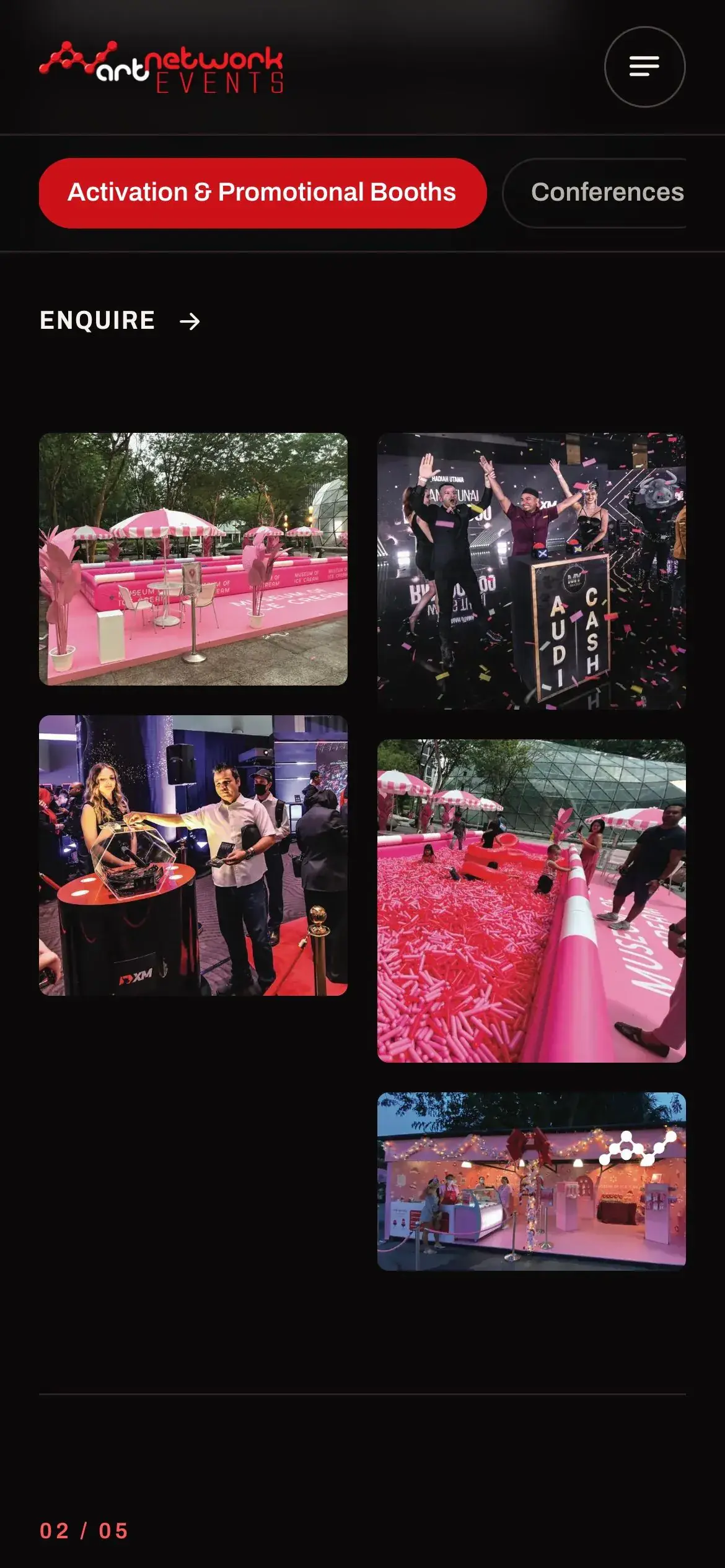
Mobile services gallery
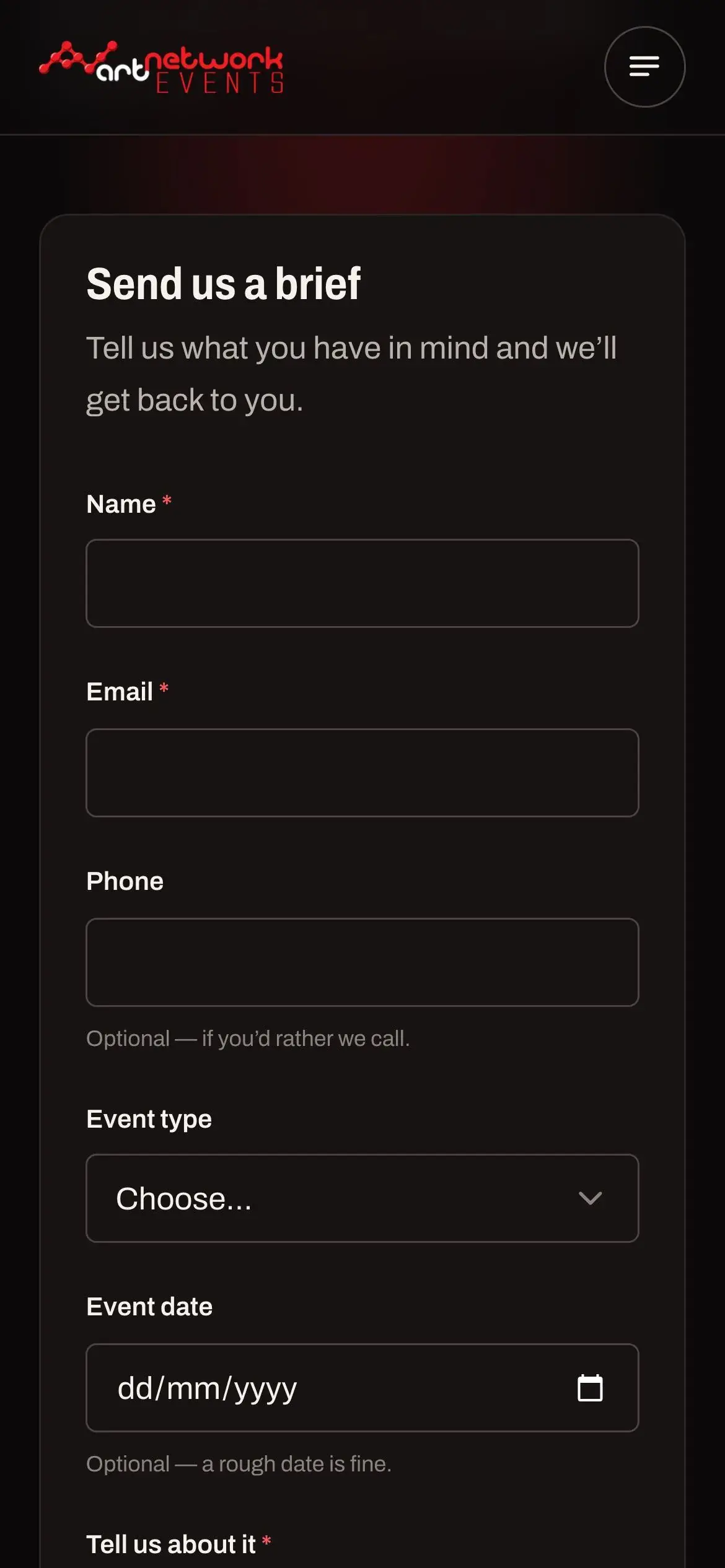
Mobile contact form
Every page was checked at 375px with no sideways scrolling. Native date and select fields are known to widen the page on phones, so single-column form layouts are set up to prevent that.
Launch polish
-
A title, meta description and social share card for every page, all managed from one data file
-
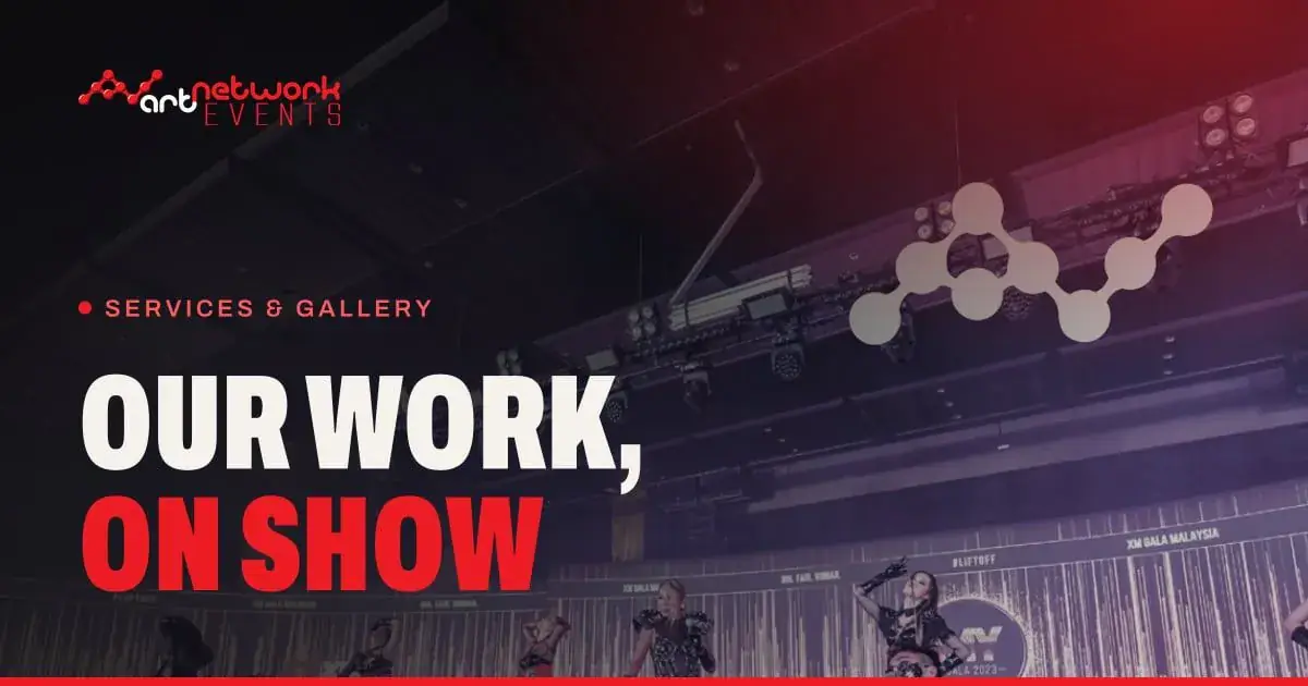
Share cards generated at build time, with the hero photo, a red glow, the logo and the page headline rendered as Archivo outlines, so links look right on WhatsApp, Facebook and Slack
-
Share image URLs include a version number, so apps that cache previews pick up a new card whenever one changes
-
Sitemap, robots.txt, and LocalBusiness structured data (address, phones, founder, founding year)
-
A 404 page in the Bold Stage style
-
Cookie-free Vercel Web Analytics
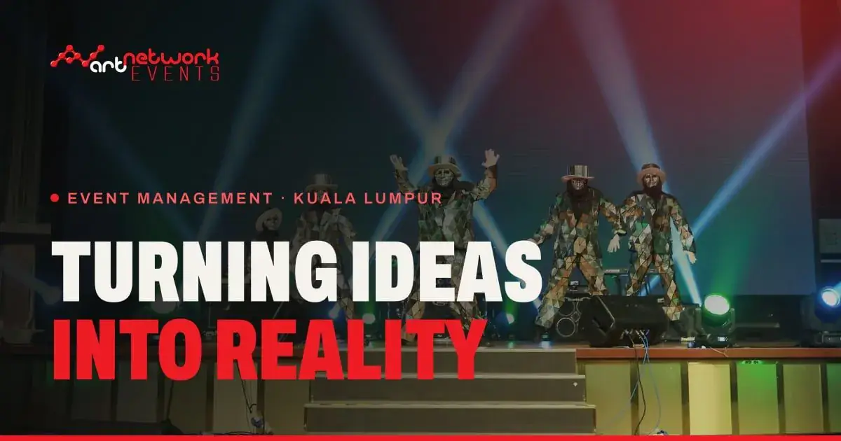
Generated social share card: Home
Generated social share card: Services
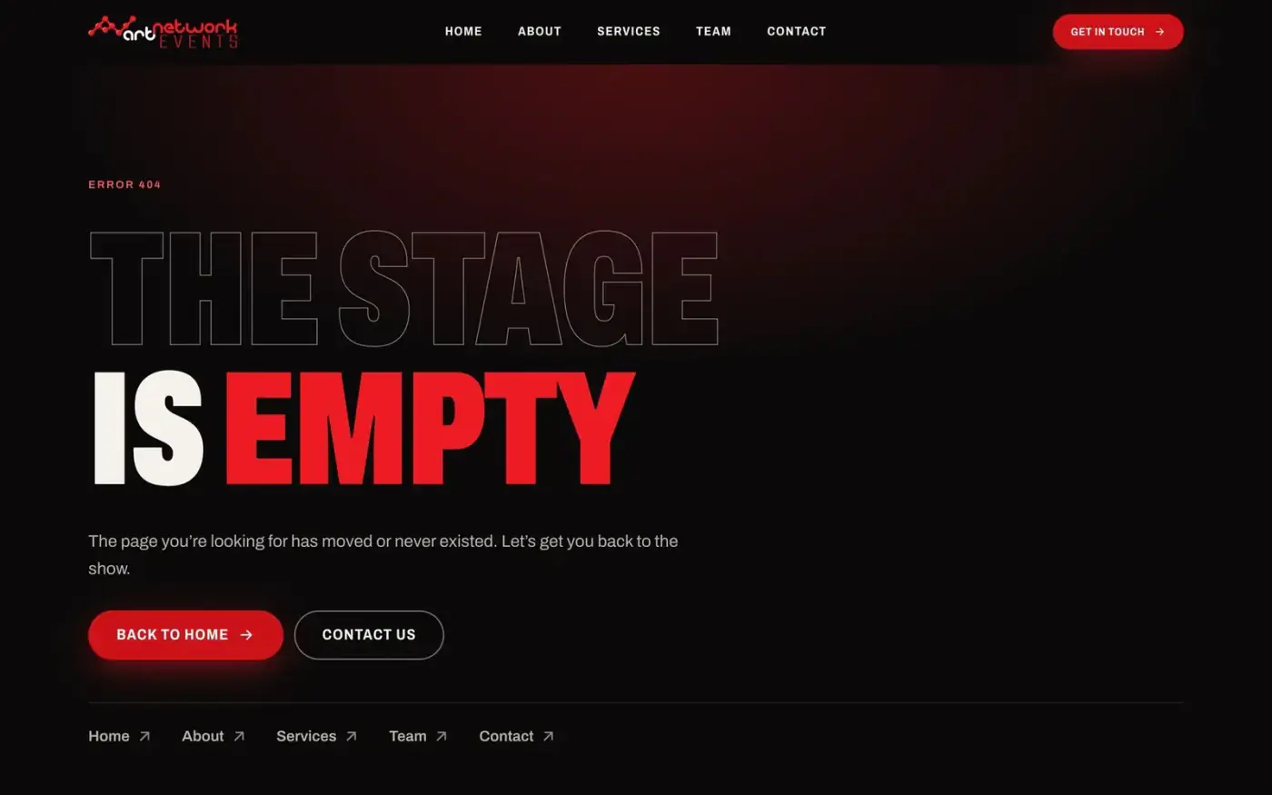
404 page
Key Design Decisions
Dark canvas, red as lighting. A near-black, slightly warm canvas makes the photos the brightest thing on screen. The red shows up as glows, a single highlighted word in a headline, hover bars and the main button, never as a full-width fill.
Fixing the colour, not the brand. The logo red failed for small text. Instead of tweaking the brand colour, I added purpose-specific tokens around it. The brand stays the same and the site passes AA.
Condensed headlines at stage scale. The home headline scales up to 184px at 62% width. It reads like a marquee and leaves room for the photo.
Galleries instead of carousels. Carousels hide most of the work. Masonry grids show it all at once, and the lightbox gives the detail when someone wants it.
Motion that respects the visitor. Hero text rises on load using CSS only, so the main message appears straight away. Below the fold, content fades up on scroll, but only once JavaScript has loaded, so nothing stays hidden if it fails. Page transitions use the browser’s built-in view transitions. All of it switches off for visitors who’ve asked for reduced motion.
Content lives outside the markup. All copy and photos live in six data files. Headlines use a light markup (*words* turn red, \n breaks the line), so the client or the next developer can edit content without touching layout.
Never make up client facts. Where the client hadn’t provided something (photo alt text, social links, some service descriptions), I left a TODO and hid that piece of the UI instead of writing placeholder copy.
Key Features
-
Spotlight hero that follows the visitor’s cursor
-
Stats that count up as they scroll into view
-
Masonry galleries with a lightbox that supports arrow keys, swipe and preloading
-
Service category bar that sticks below the header and tracks your scroll position
-
Contact form that works without JavaScript, has spam protection, and falls back to opening the visitor’s email app
-
Social share cards generated at build time, one per page
-
A live
/styleguidethat renders every token, type size and component straight from the code -
Handover docs: README, design system reference, and a rules file for AI coding agents
Outcome
The site went from a direct copy of the Figma frames to a design system I can defend, rule by rule, with Lighthouse accessibility at 100 on every page and performance at 99–100 on mobile. It’s live at art-network-my.vercel.app. Bold Stage is documented well enough that the next page or the next developer will stay on-brand without me there.
Still to come from the client: alt text for the event photos, real social profile links, confirmed copy and more photos for each service category, and a custom domain.
Reflection
The most useful thing I did was build the Figma version first and then let myself say it wasn’t right. Static frames hide how a page feels when you scroll it. Once it was live in the browser, it was clear that red as a background was doing the opposite of what the brand needed.
Prototyping three directions with real content made the choice easy. When photos, copy and stats stay the same, the only question left is the right one: which style suits these clients and this kind of photography?
It was also a good feeling to come back to a client I first designed for in 2015, on Wix, and hand over a site that’s custom-built, measured, and documented well enough to keep going without me.