UX/UI Strategy, Design & Development
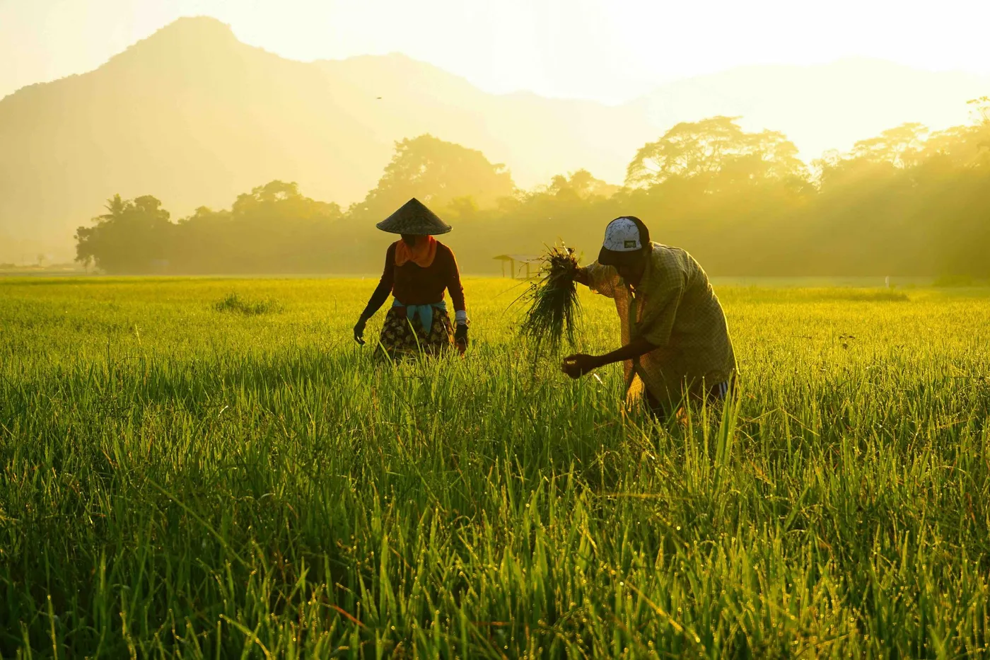
End-to-end website redesign for a mission-led agri-tech organisation working to reduce methane emissions from smallholder rice farming across Cambodia and Pakistan.
- When
- Apr 2026
- Type
- Tools
- Link
- www.netzero-ag.com ↗
Overview
NetZeroAg is an agricultural technology company working with over 140 million smallholder rice farming families across South Asia. Their mission: reduce greenhouse gas emissions from rice farming, one of the largest and most overlooked contributors to global agricultural emissions, while improving farmer livelihoods.
This was a full website overhaul. Everything. IA, copy, design, and build.
The Problem
NetZeroAg’s existing Framer site was visually polished but operationally broken for their goals.
The core issues:
-
Framer’s dynamic rendering made the site invisible to search engines — zero organic discoverability
-
Information architecture didn’t reflect how audiences think — partners, investors, and carbon credit buyers couldn’t find what was relevant to them
-
Academic copy kept visitors at arm’s length — the writing assumed scientific familiarity and failed to communicate the human story behind the work
-
No CMS — every blog update required a developer
-
Credibility signals were buried — Gold Standard certification, the Mars partnership, and world-first milestones weren’t front and centre
The site wasn’t converting. It wasn’t indexable. And it wasn’t telling the right story.
My Role
-
Discovery — stakeholder interview, site audit, IA mapping
-
Copywriting — full site copy across all 8 pages, written from scratch with a storytelling-first directive
-
HiFi Design — desktop UI in Figma, built from client-supplied brand assets
-
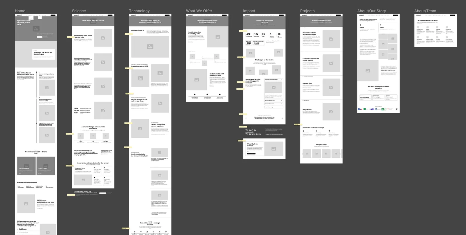
Webflow Build — full development including responsive layout, CMS blog, contact form, newsletter signup, GA4, and light SEO setup
-
CMS Migration — migrated all existing blog articles from Framer into Webflow CMS
-
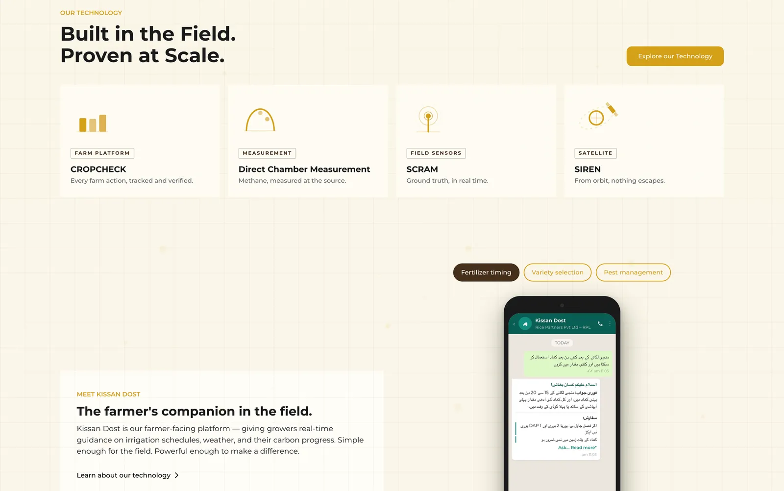
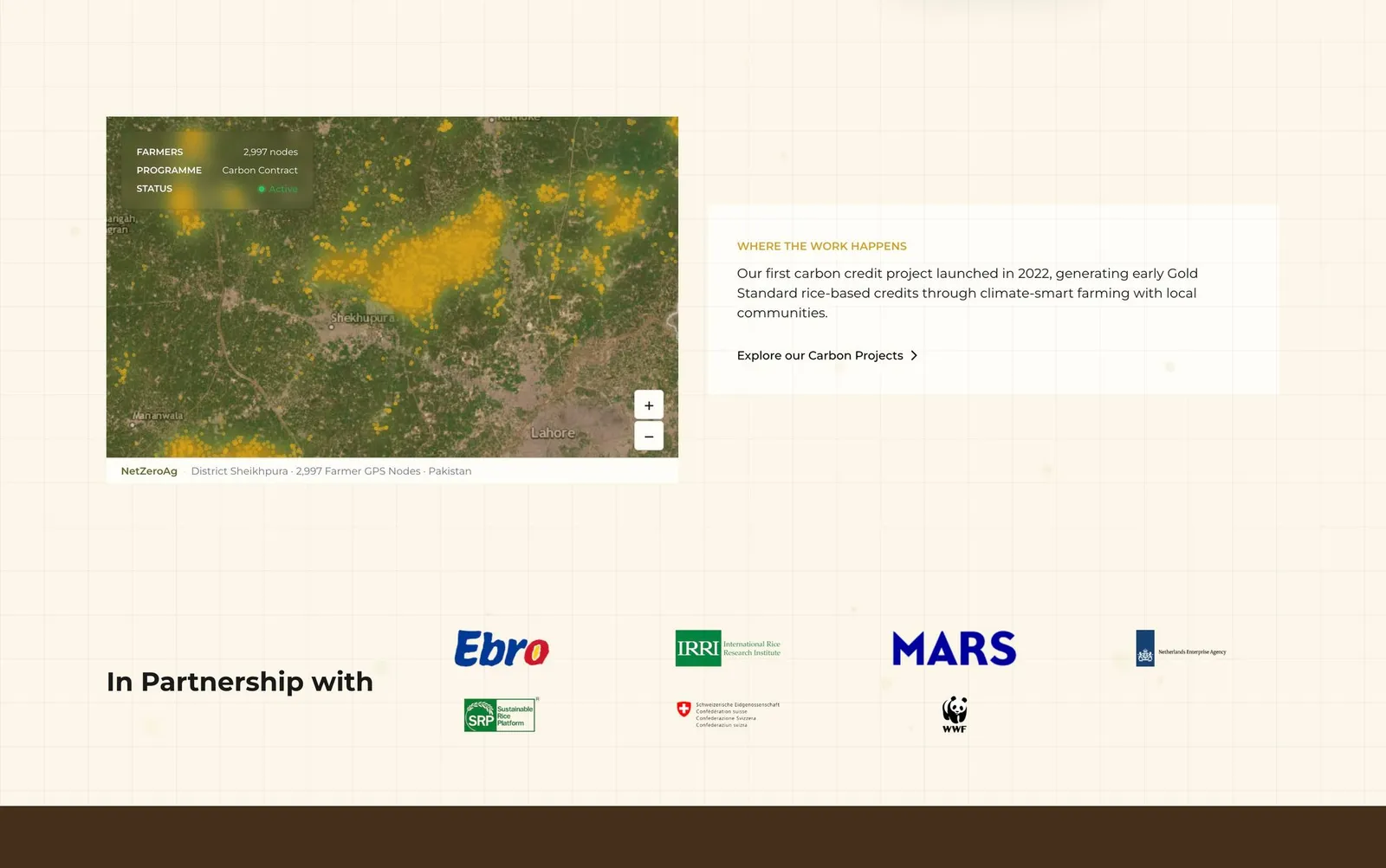
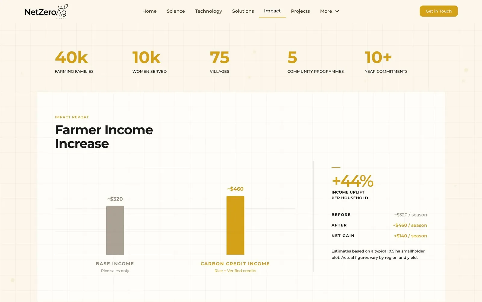
Custom Interactive Embeds — designed and built animated data visualizations and interactive graphics as self-contained Webflow HTML embeds, including scroll-triggered carbon credit charts, emissions comparisons, impact maps, and farmer income stat panels
The Challenge
Three things made this harder than a typical web project:
1. Subject matter complexity. Rice farming, methane emissions, alternate wetting and drying, MRV systems, Gold Standard certification, satellite imagery, carbon markets. All of it had to be made accessible without losing credibility.
2. Multiple audiences with different needs. Corporate partners want sustainable rice supply chains. Carbon credit buyers want high-integrity, auditable credits. NGOs and institutions want impact proof. Investors want scalability. The same site had to speak to all of them without being a wall of text.
3. Working within an existing brand. No brand redesign was in scope. The visual identity — dark olive greens, earthy tones, serif/sans pairing — was fixed. The design challenge was to build something warm and human within those constraints.
Approach
Narrative first
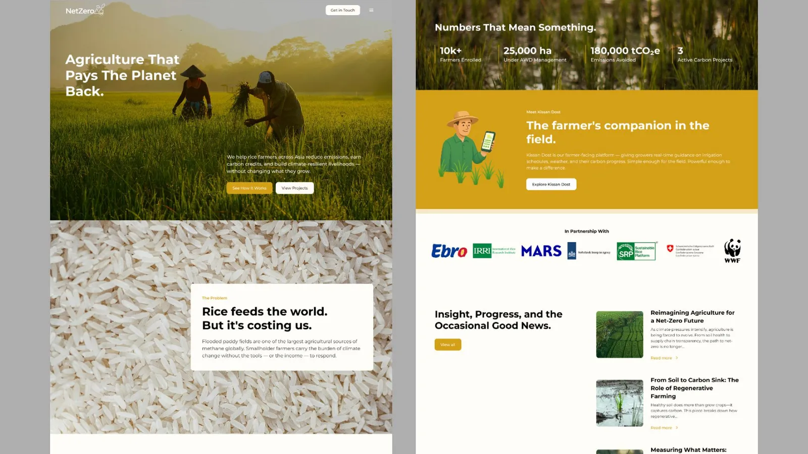
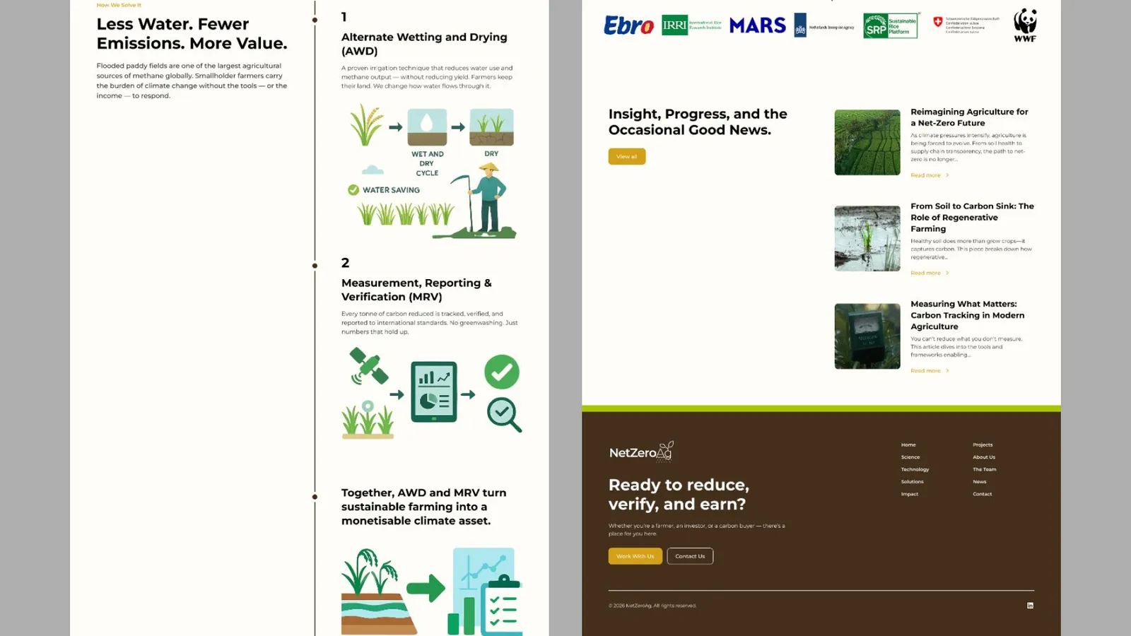
The approved structure was: Problem → Science → Solution → Impact. Every page was written and designed to carry the visitor through that arc. You don’t lead with carbon credits. You lead with people — farmers, families, flooded fields.
The homepage hero opens with: “Agriculture That Helps The Planet Back.” The Science page opens with: “Rice feeds half the world. Most people have never heard of this.” That’s the register.
IA that reflects audience intent
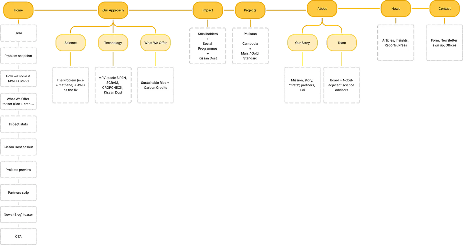
The old site’s nav grouped content by what the organisation did. The new IA groups by what visitors are trying to understand: the problem, the science, the technology, the impact, the projects. Each page earns its place in the journey.
Page structure:
-
Home
-
About / Who We Are
-
Science — The Problem + AWD
-
Technology — SIREN, SCRAM, Kissan Dost
-
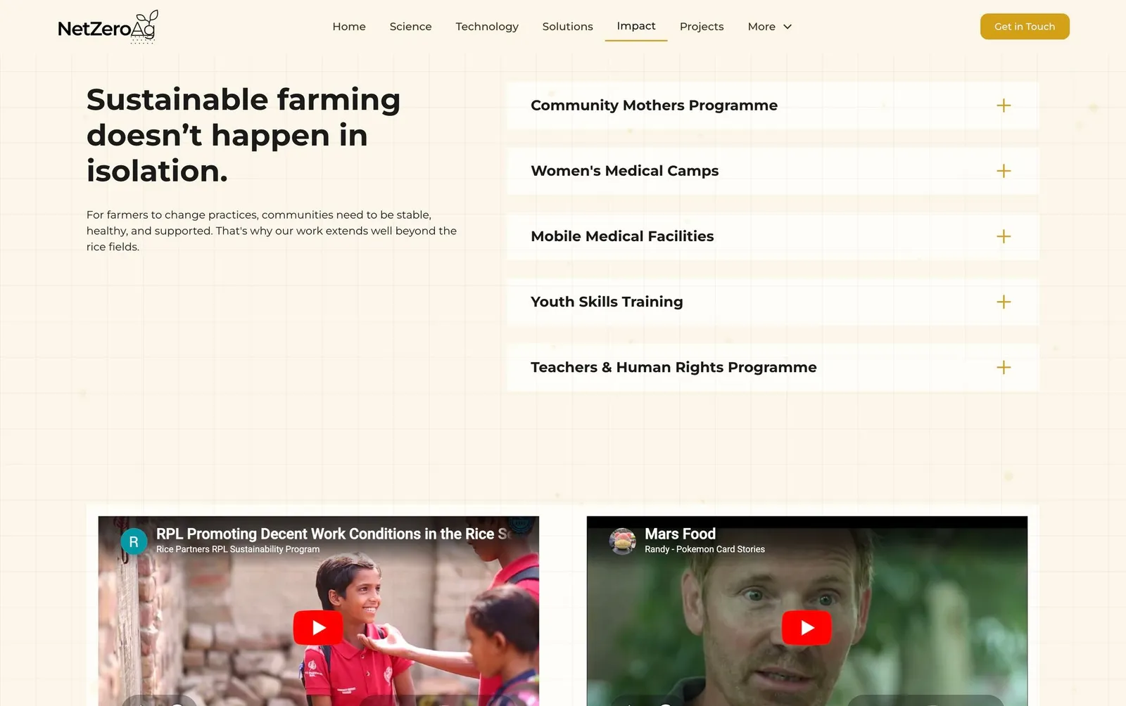
Smallholder Impact
-
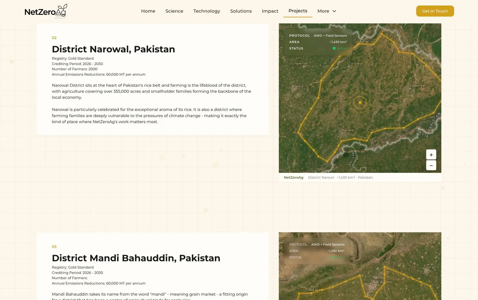
Carbon Projects — Pakistan + Cambodia
-
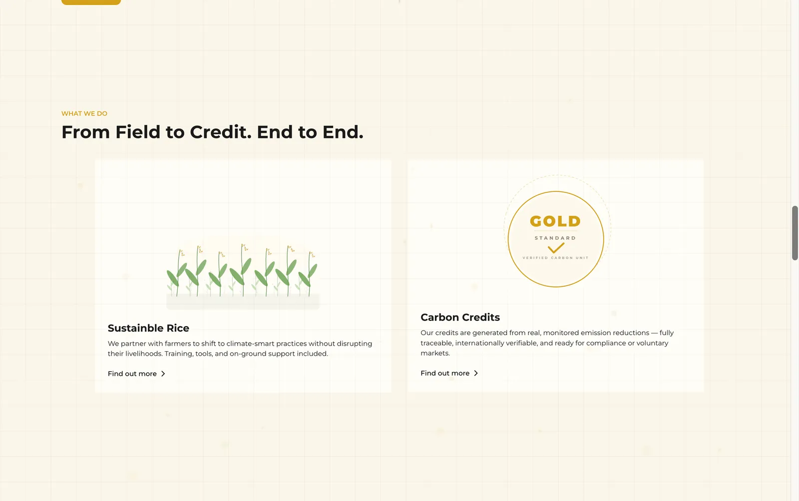
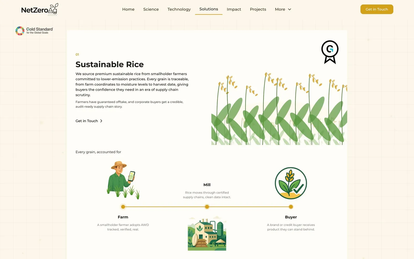
Solutions — Sustainable Rice + Carbon Credits
-
News / Blog (CMS)
Illustrations as a differentiator
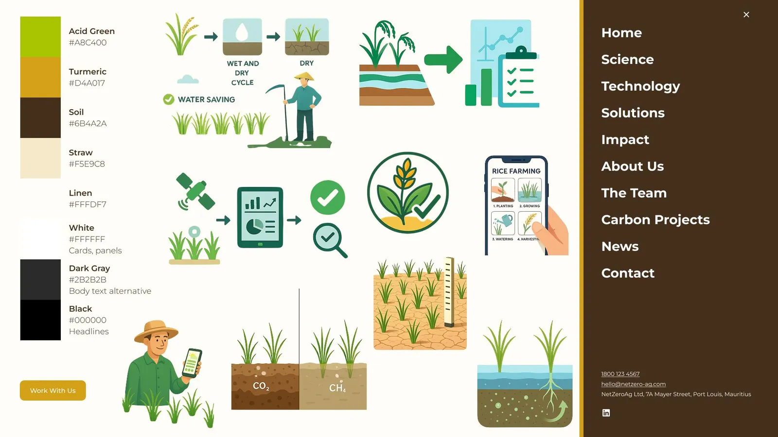
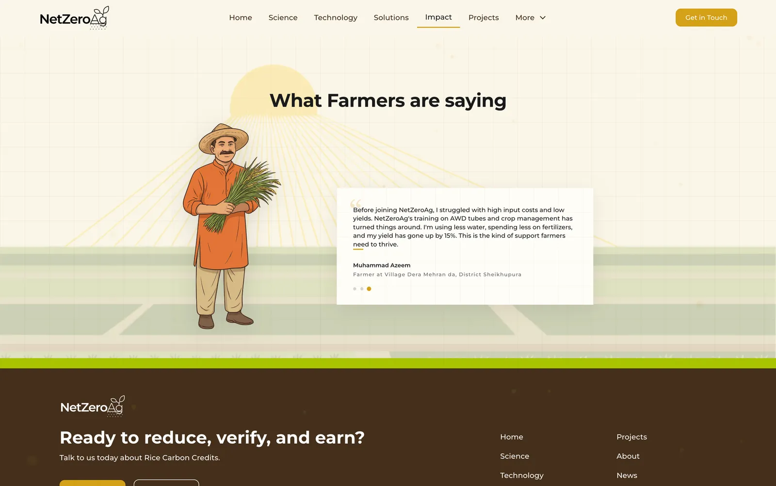
Stock photography of farmers reads as generic NGO content. Real photography wasn’t fully available at design time. The solution: AI-generated cartoon farmer illustrations — consistent, ownable, warm — used as editorial texture throughout. Client approved and funded the illustration sourcing.
Data as narrative
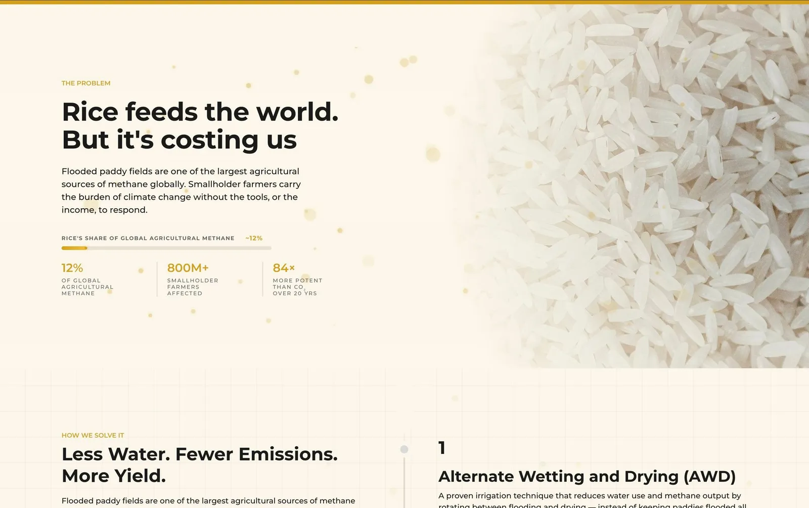
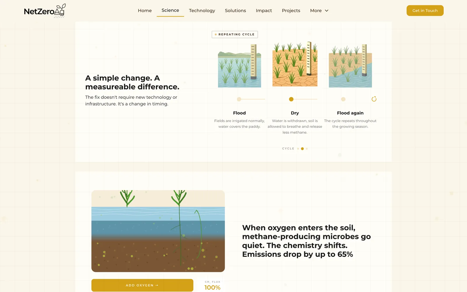
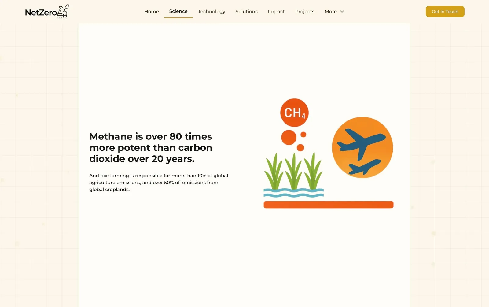
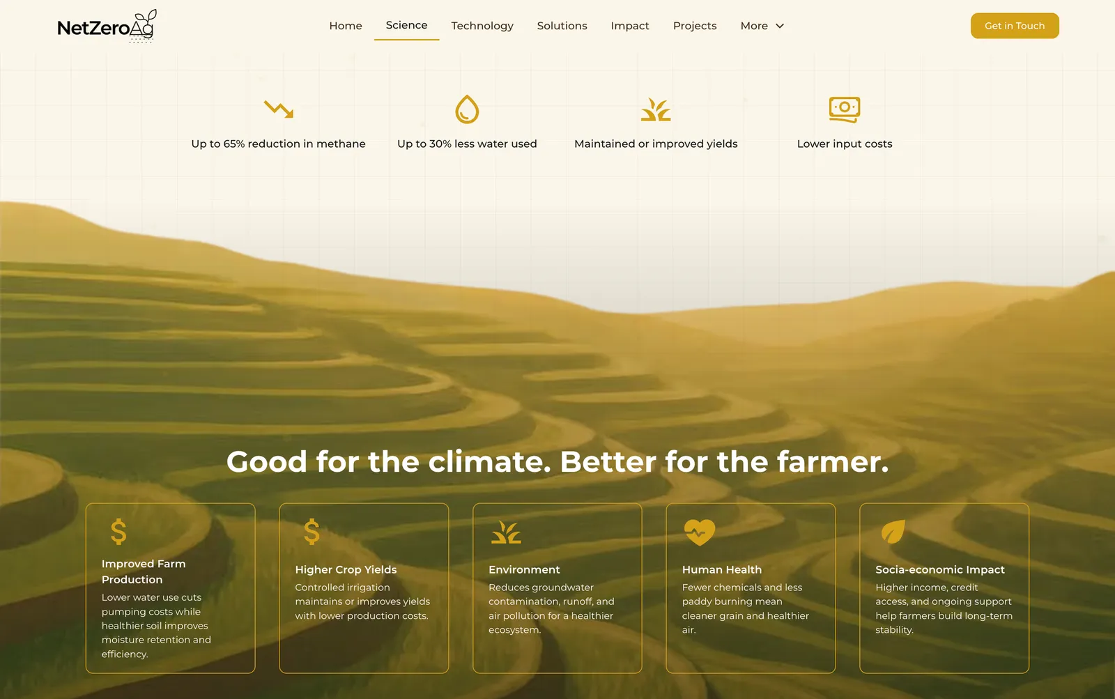
Abstract impact numbers — methane reduction percentages, carbon credit yields, farmer income uplift — weren’t landing as static figures. The solution: custom HTML/CSS/JS embeds with scroll-triggered animations. Bar charts that grow on entry. Stat counters that tick up as you reach them. Particle effects and glow pulses that punctuate the moment a number lands. Interactive maps that show where the work actually happens on the ground.
A cohesive design system — warm cream background, gold accents, Montserrat — was locked in across all components so the embeds feel native to the site, not bolted on. The result: data that earns attention instead of demanding it.
Technology as credibility, not jargon
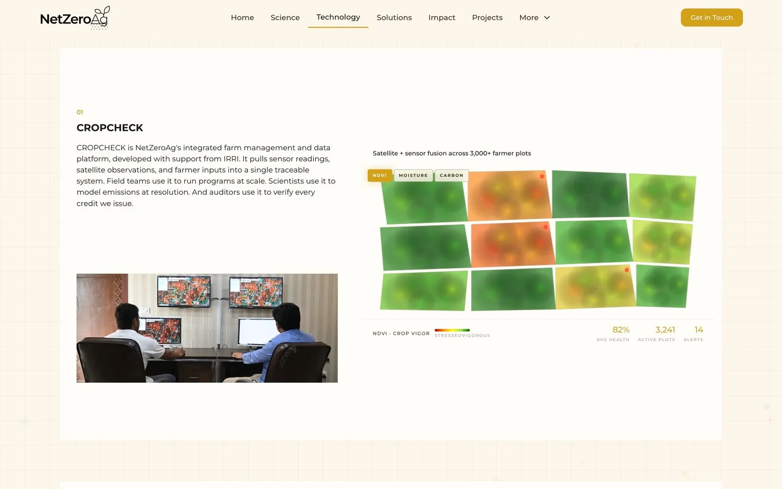
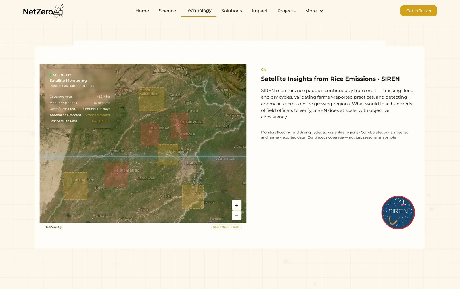
Kissan Dost (the voice AI assistant for farmers), SIREN (satellite-based crop monitoring), and SCRAM (emissions modelling) are genuine differentiators. They got dedicated real estate on the Technology page — not footnotes.
Key Design Decisions
Dark, earthy palette — leaned into it. The olive green and brown tones could have felt heavy. Instead they were used to convey groundedness, trust, and environmental rootedness. White space does the breathing.
Large editorial photography sections. Satellite imagery and field photography are used as full-bleed section dividers — not decorative, but contextual. You’re seeing what the tech sees.
Farmer quotes as structural anchors. Pull quotes from farmers appear throughout multiple pages, not just a dedicated testimonials section. They interrupt technical content and re-ground the reader in the human stakes.
The footer CTA. Every page closes with: “Ready to reduce, verify, and earn?” — direct, active, audience-agnostic. It’s an invitation regardless of whether you’re a farmer partner or a corporate buyer.
Partner logos as credibility, not decoration. Ebro, Mars, SSD, WWF, SDC logos appear in context — on pages where third-party trust matters. Not buried in a generic footer strip.
Interactive embeds over static infographics. Complex data needed to land emotionally, not just informationally. Custom animated embeds — built from scratch in HTML/CSS/JS and deployed as Webflow embed elements — turned statistics into moments. The kind that make a visitor stop scrolling.
Reflection
This project reinforced something I already believed: the brief is rarely the real problem. The ask was “redesign the website.” The real problem was that nobody outside the organisation understood what NetZeroAg actually did, and why that mattered.
Working across all four phases solo — discovery, copy, design, and build — meant nothing got lost between handoffs. The narrative intent in the copy showed up directly in the design. The design constraints shaped the build. That coherence is visible in the final product.
A fifth layer came later: a sustained round of post-build refinement using Claude as a build partner, ideating interactive data components, writing and tuning the embed code, and iterating on animation behaviour until each piece felt considered. It changed how I think about what a solo designer can produce.
The subject matter was genuinely interesting. Rice farming causing more emissions than aviation is the kind of fact that makes you stop. Getting that across without making a visitor feel lectured at was the core creative challenge of the whole project.
NetZeroAg | Sustainable Rice. Real Carbon Credits. ↗
read the contents of this page, its images, i need a portfolio product case study write up in this format the problem, my approach, key decisions, outcome