AI Interview Replit Prototype
24-hour take-home design exercise: redesigning CoffeeSpace's AI interview entry point for their Early Talent platform. Went beyond the brief with a working Replit prototype.
- When
- Mar 2026
- Type
- Tools
- Link
- www.figma.com ↗
Overview
CoffeeSpace connects early-stage founders with high-ownership talent through an AI-first matching process. For their 24-hour take-home, I was asked to design a single desktop homepage for their Early Talent platform — the entry point where candidates understand and start a voice interview with Luca, CoffeeSpace’s AI interviewer.
The Brief
Design a single desktop homepage where candidates can understand and start an AI voice interview with Luca, CoffeeSpace’s AI interviewer. The page surfaces their existing profile data and preferences alongside the call entry point.
In scope
-
Header with logo, Early Talent label, visibility status, candidate avatar
-
AI interview call section — Luca’s message, voice indicator, missing info state, start CTA
-
Talent profile — LinkedIn-ported experience and education, plus CoffeeSpace’s 7-section candidate summary
-
Preferences — Location, Culture, Role & Skills
Out of scope: Onboarding flows, chat/attachments, compensation fields, resume upload
Approach
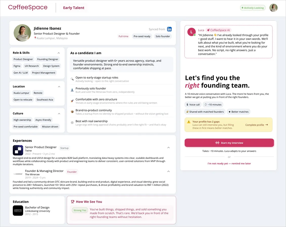
I treated this as a trust-building surface, not just a data page. Candidates arriving here need to feel confident in what Luca already knows about them before starting an interview — so the design logic was: show before you ask.
The layout splits into two zones:
-
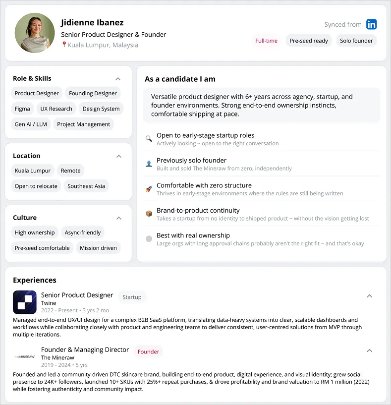
Left — Candidate profile — LinkedIn-synced experience and education, role/skills tags, culture fit signals, location preferences, and a “As a candidate I am” summary generated from profile data. Grounded in what CoffeeSpace already knows.
-
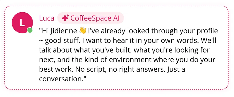
Right — Luca’s panel — A warm, direct message from Luca (not a generic chatbot intro), followed by the value prop headline, call format details (voice, ~10 min), and a high-contrast “Start my interview” CTA. Profile gap state is surfaced inline without blocking the interview start.
References used: Jack & Jill (CTA patterns for AI voice products), CoffeeSpace mobile app (visual language, color, typography), CoffeeSpace.com/CoffeeSpace.ai (brand positioning and tone).
Key Design Decisions
Two-column layout with hard left/right separation
Kept profile and interview entry in distinct zones so neither competes for attention. Candidates can review their data without losing sight of the primary action.
Luca speaks first
The AI panel leads with Luca’s personalised message rather than a headline or generic explainer. Sets a conversational tone immediately and reduces the “what is this?” friction.
Profile gap as helper, not blocker
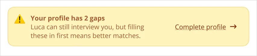
The “Your profile has 2 gaps” state surfaces inline with a soft yellow callout — Luca can still interview, but filling gaps means better matches. Doesn’t gate the CTA.
“How We See You” section
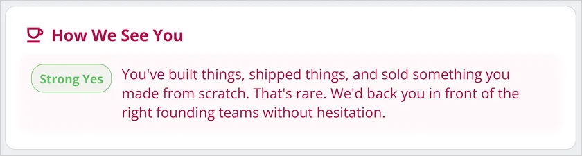
Added a CoffeeSpace-generated founder assessment card (“Strong Yes” / “Needs Work” / etc.) as a closing signal — shows candidates they’re already being evaluated, raises stakes for the interview.
Visibility status in header
ActivelyLooking pill in the nav mirrors LinkedIn-style availability — keeps the page contextually grounded in job-searching mode.
Beyond the Brief — Replit Prototype →
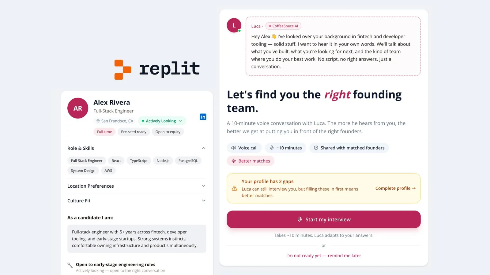
Alongside the Figma deliverable, I built a working prototype in Replit to demonstrate how the Luca interview entry state would feel in motion — including the transition from profile review to interview start. Went the extra mile to show how the design lives, not just how it looks.
coffee-space-concept—jdnibanez.replit.app/ ↗
Figma File
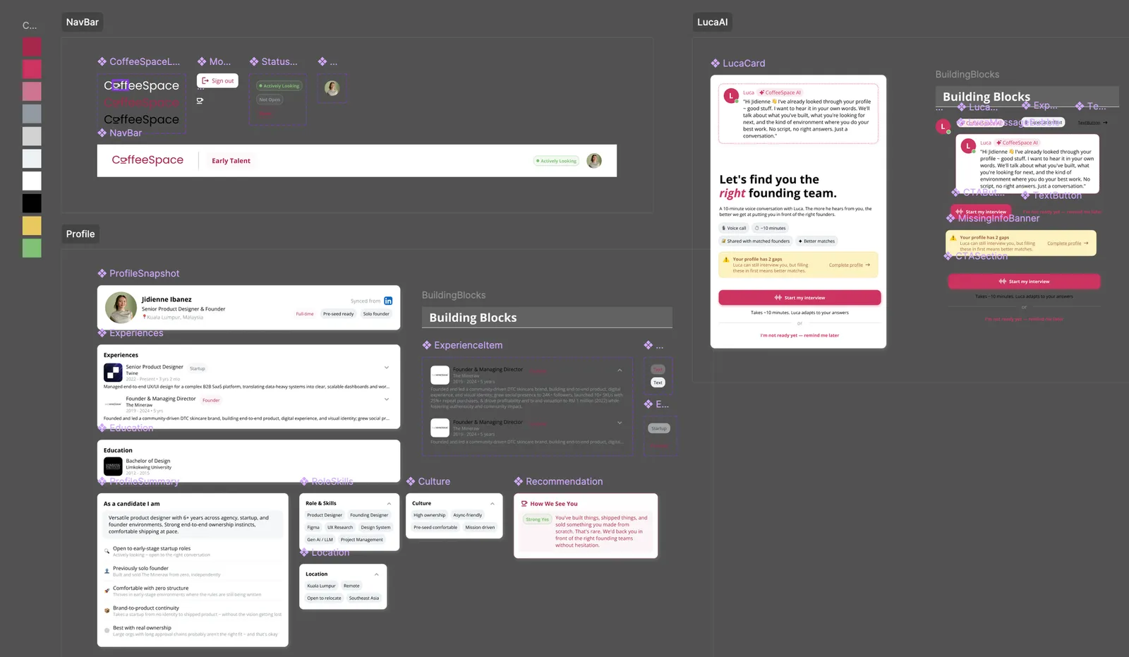
Includes: cover, brief summary, desktop design, design decisions & tradeoffs, process notes, and component breakdown.