UX Research & Mobile Dashboard Redesign
Began as a design challenge submission for a Founding Product Designer role.
- When
- Apr 2026
- Type
- Tools
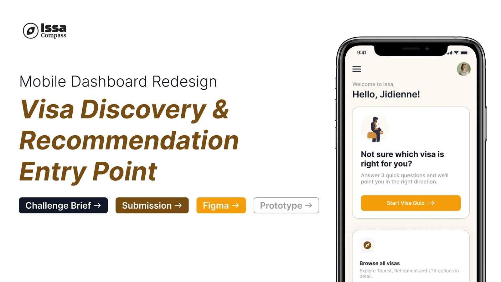
Issa Compass is a Bangkok-based immigration tech startup helping expats navigate the Thai visa process. This project began as a design challenge submission for a Founding Product Designer role. Though I wasn’t selected, the problem space resonated deeply ~ I’ve spent most of my life navigating visa processes as a foreigner so I’m sharing it here as a speculative redesign grounded in real user research.
The Problem
Immigration is one of the most anxiety-inducing processes a person can go through. Issa Compass exists to change that. But after auditing their mobile app, I found a fundamental tension at the core of the product:
The app waits for users to find their own path, then hands them a list they don’t understand.
A user arrives at Issa Compass because they’re confused about visas. The product’s response is to show them a scrollable list of 10+ options with bureaucratic labels — LTR, NON-B, SMART — and expect them to self-diagnose. There’s no guided path, no recommendation layer, no sense that the product knows who you are or why you’re there.
The most critical moment in the user journey — the moment someone decides whether to trust Issa with something as high-stakes as their legal right to stay in a country — is handled by a blank beige card buried under “Other services.”
My Role
Solo designer. End-to-end — research, synthesis, prioritisation, and redesign proposal.
Timeline: 4 days
Research
To validate my instincts, I sourced three expats currently navigating the Thai visa process and conducted short interviews via WhatsApp and Instagram DM.
Sourcing method: Cold outreach via Instagram and the Expats in Bangkok Facebook group. One participant through a personal connection.
Who I spoke to
What the research told me
Key Concerns & Opportunities
#1 — No guided path to the right visa
Users self-diagnose from a list they don’t understand. Drop-off before application starts = zero conversion, zero revenue.
#2 — The dashboard doesn’t know who you are
”For You” implies personalisation. The experience delivers none. A new user and a returning user see the exact same screen.
#3 — Visa browsing is buried
The most important action in the product lives in a blank card under “Other services.” No description, no hook, no visual weight.
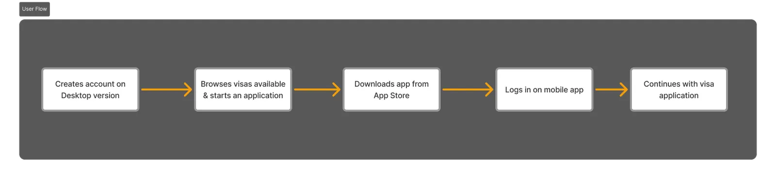
#4 — Desktop and mobile feel like different products
Users who sign up on desktop and manage on mobile encounter different layout logic, different hierarchy, different entry points. The mental model doesn’t carry over.
The Redesign
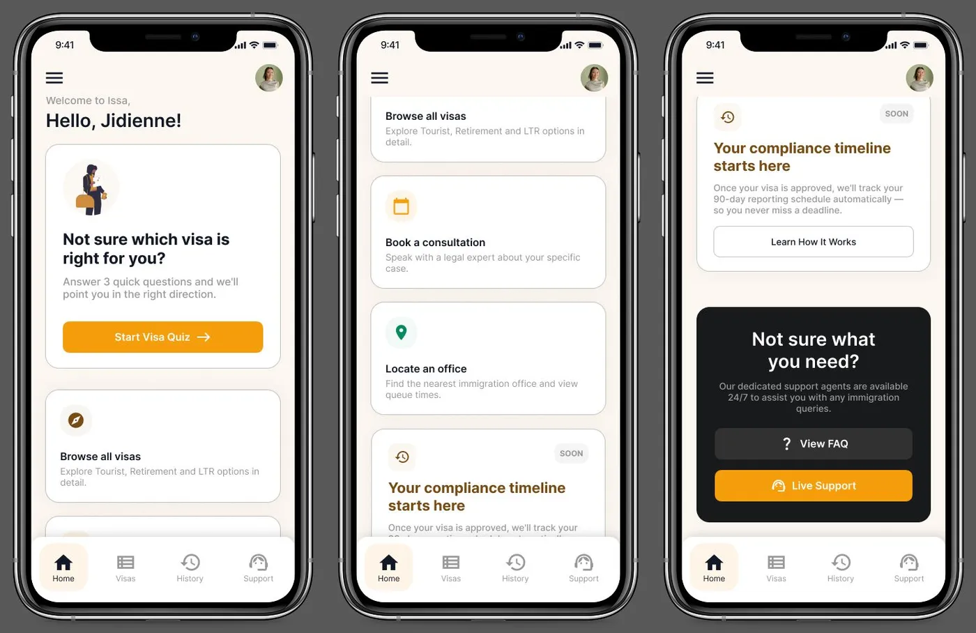
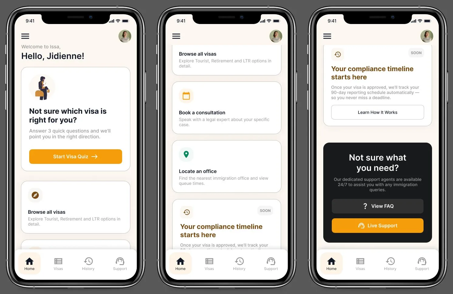
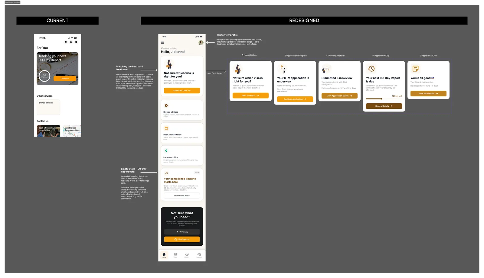
Focus: Mobile dashboard — the first screen a returning user sees after login.
How does my redesign address it?
Personalised header + tappable avatar
Greets the user by name. Avatar opens a profile view with visa status and application stage ~ navigation shortcut and live status indicator in one.

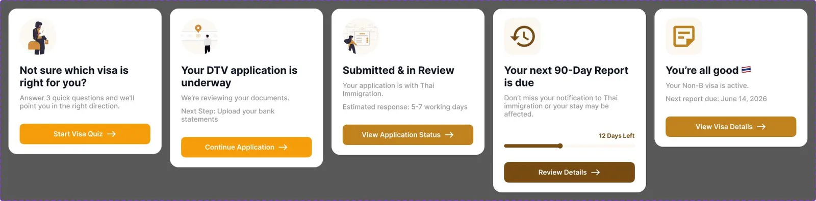
State-aware hero card
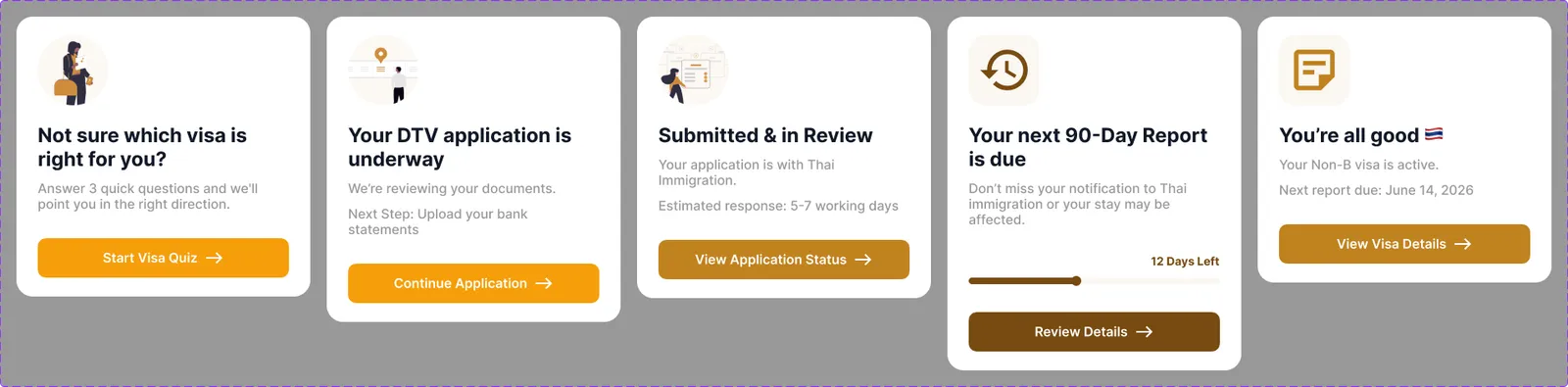
The hero card changes based on where you are in your journey: New user, Application in progress, In review, Report due, All clear
Visa quiz as the primary action
The eligibility quiz becomes the first thing a new user is invited to do. The full visa list stays as a fallback for users who already know what they need.
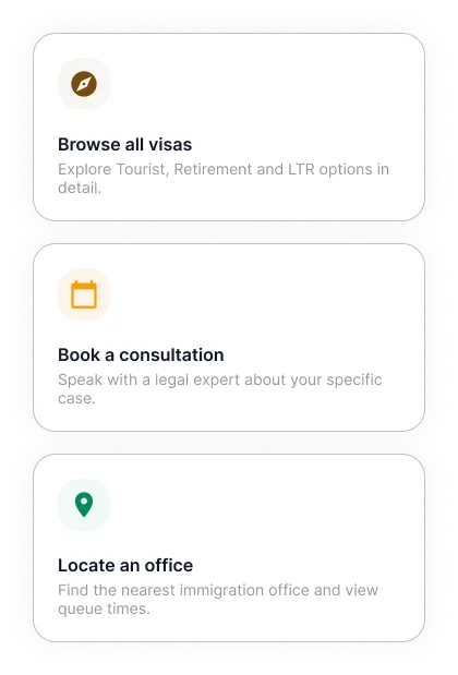
Redesigned services section
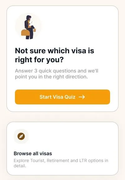
Each card now has a plain-language description so users understand what they’re tapping before they commit.
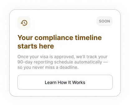
Empty state for new users
New users don’t see the 90-day report card. Instead >
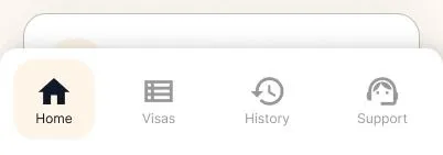
Persistent bottom nav
Home / Visas / History / Support mirrors the desktop structure and closes the cross-device continuity gap.
Assumptions
-
The eligibility quiz exists and can be elevated rather than rebuilt from scratch
-
The app has enough post-login data to detect user state and serve the right hero card
-
The illustrated character style from desktop can carry into mobile to unify both platforms
-
Human support via WhatsApp and consultation remains available, this redesign supplements it, not replaces it
Measuring Success
North star metric: quiz → application conversion rate
| Metric | What it tells us |
|---|---|
| Quiz start rate | Are users engaging with the guided path |
| Quiz completion rate | Is the quiz framed well enough to finish |
| Quiz → application conversion | Is the recommendation building confidence |
| Time to first application | Is first-session friction reducing |
| Dashboard bounce rate | Are users leaving immediately after login |
| Support contact rate | Is the product answering questions the team handles manually |
Reflection
This project is personal. I’ve been a foreigner navigating visa processes my entire life — Employment Passes, dependent visas, tourist extensions, bureaucratic paperwork in languages I don’t speak. I know exactly what it feels like to open a government portal, see a wall of options you don’t understand, and quietly panic.
That’s what made this brief land differently. Issa’s mission isn’t just good business — it’s genuinely necessary. The opportunity here isn’t to make a prettier interface. It’s to build the trusted guide that most people never had.
I didn’t get the role. But I’d still ship this.