Brand Identity
A calm, premium brand identity for a modern wellness clinic: logo, colour palette, and typography system built around stillness, restraint, and long-term credibility.
- When
- Feb 2023
- Type
- Tools
Project Overview
The Wellness Suite is a modern wellness clinic focused on holistic self-care, balance, and intentional living. The goal of this project was to create a calm, premium, and trustworthy brand identity that feels grounded yet contemporary.
My Role
Brand Identity Designer
I led the project end-to-end, including:
-
Brand direction and visual strategy
-
Logo design and refinement
-
Color, typography, and system decisions
-
Creation of a cohesive visuals
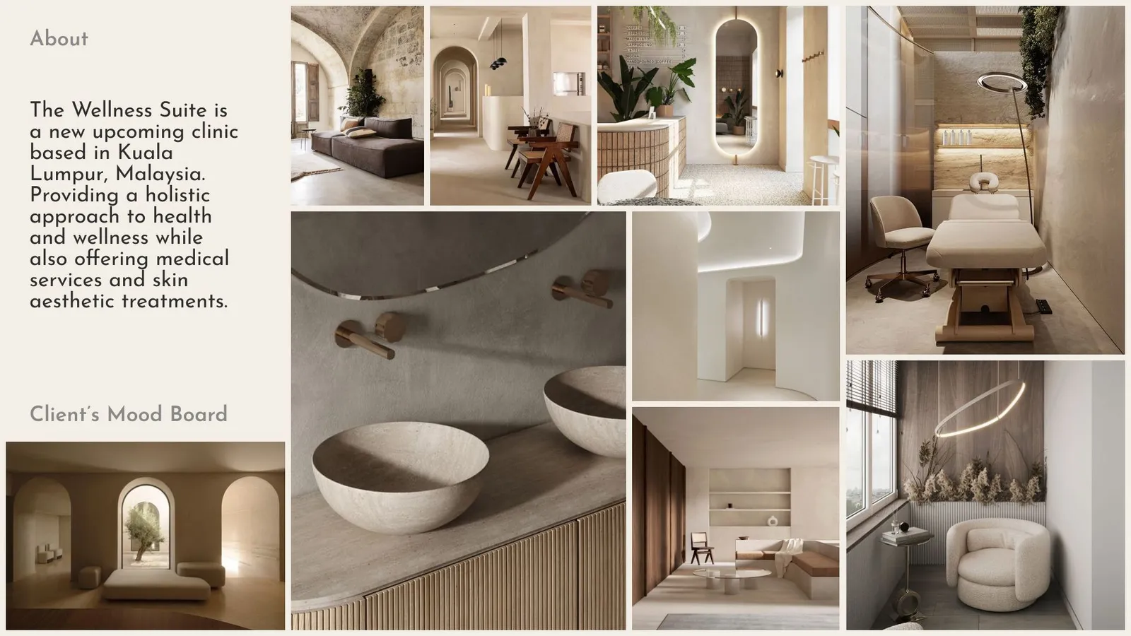
Brand Strategy & Direction
Core Brand Traits
The Wellness Suite’s identity is built around three key attributes:
-
Calm – a sense of stillness and balance
-
Refined – premium without being intimidating
-
Intentional – every element serves a purpose
Rather than leaning into overly organic or overly clinical aesthetics, the brand sits intentionally in between — balancing softness with structure.
Design Decisions
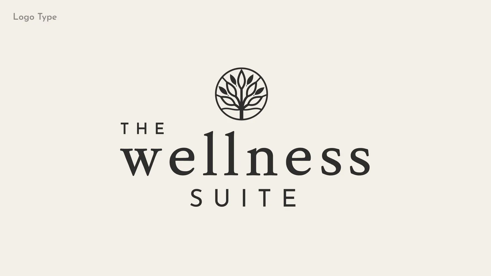
1. Logo Design
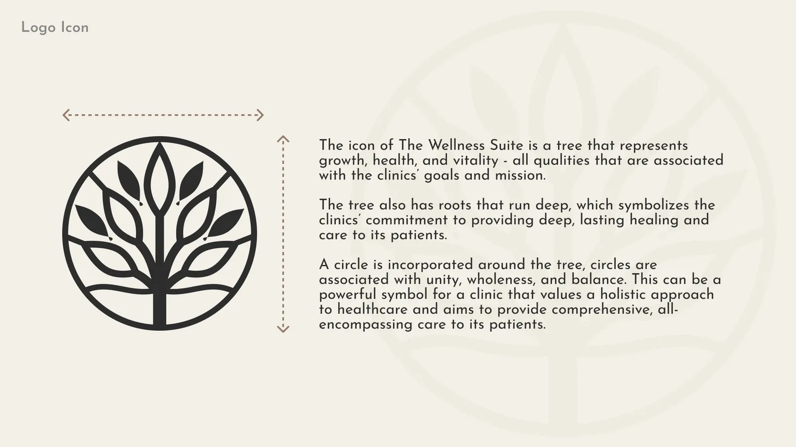
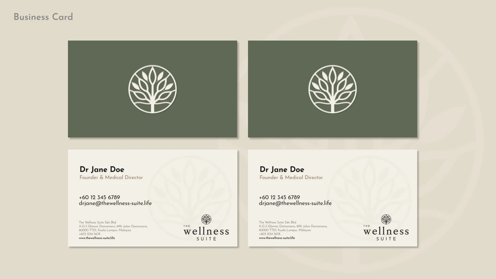
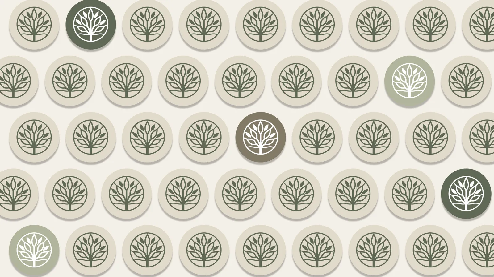
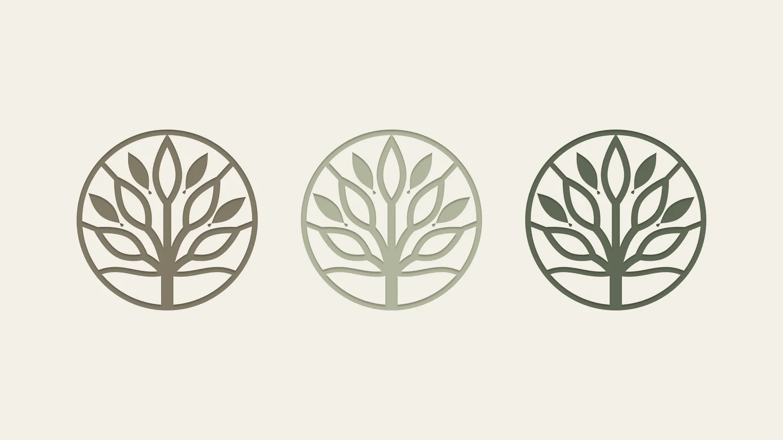
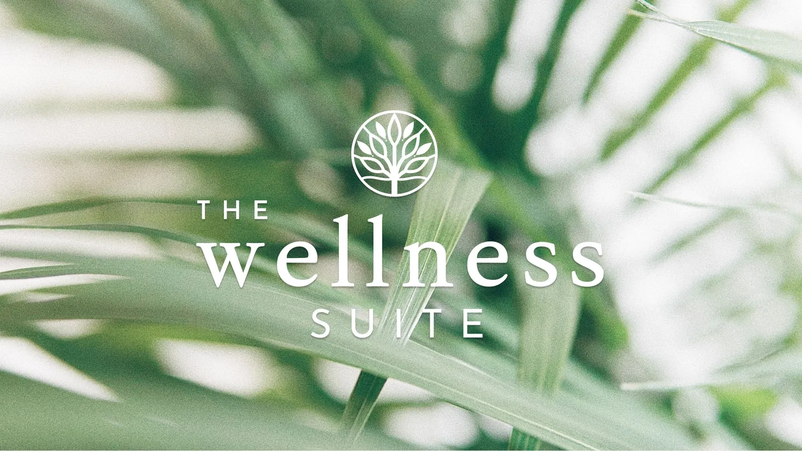
The client specifically requested the use of a tree motif to symbolise health, wellness, growth, and longevity, and shared visual references to guide the direction.
Key design decisions:
-
The tree form was reduced to its essential structure, representing strength and stability without excess detail
-
Soft curves were used to maintain a sense of calm and approachability
-
Symmetry and balance were prioritised to reflect holistic wellness and alignment
-
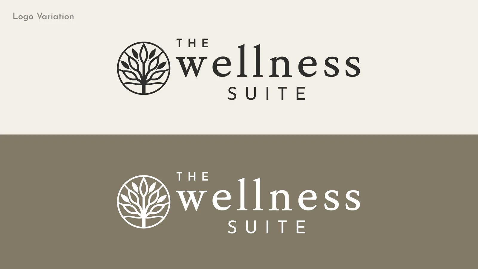
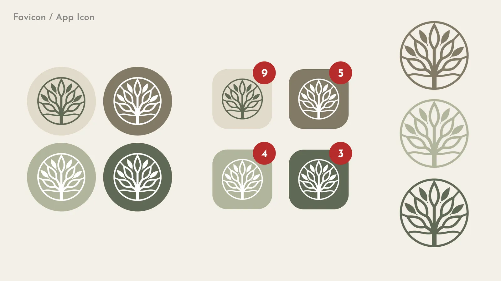
The minimal execution ensures the logo remains versatile across digital, print, and physical environments
2. Color Palette
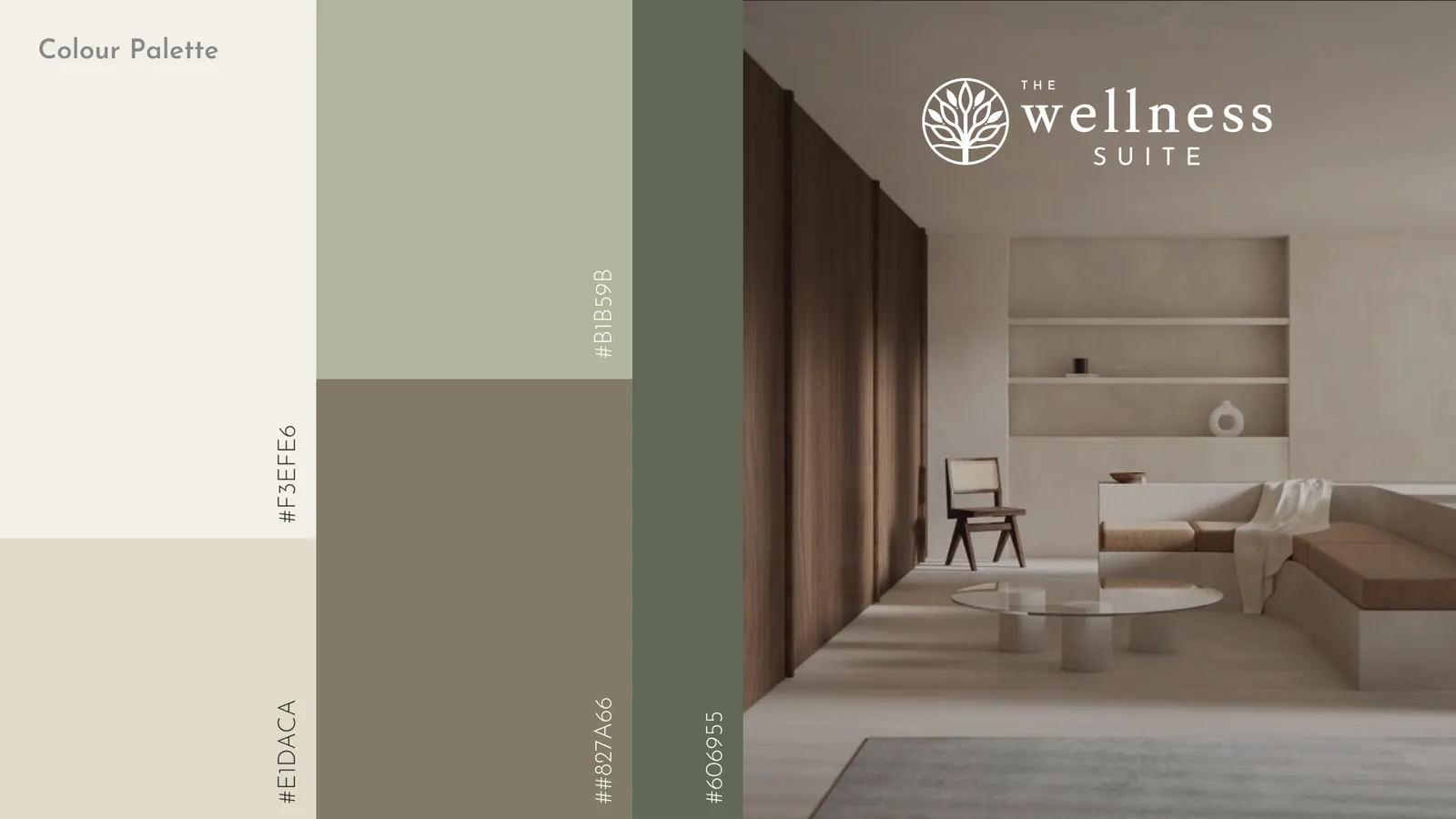
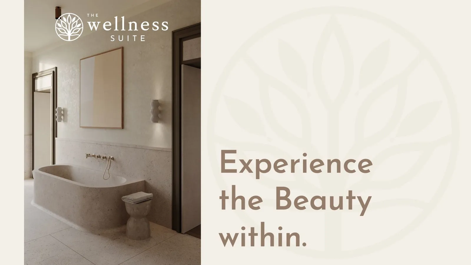
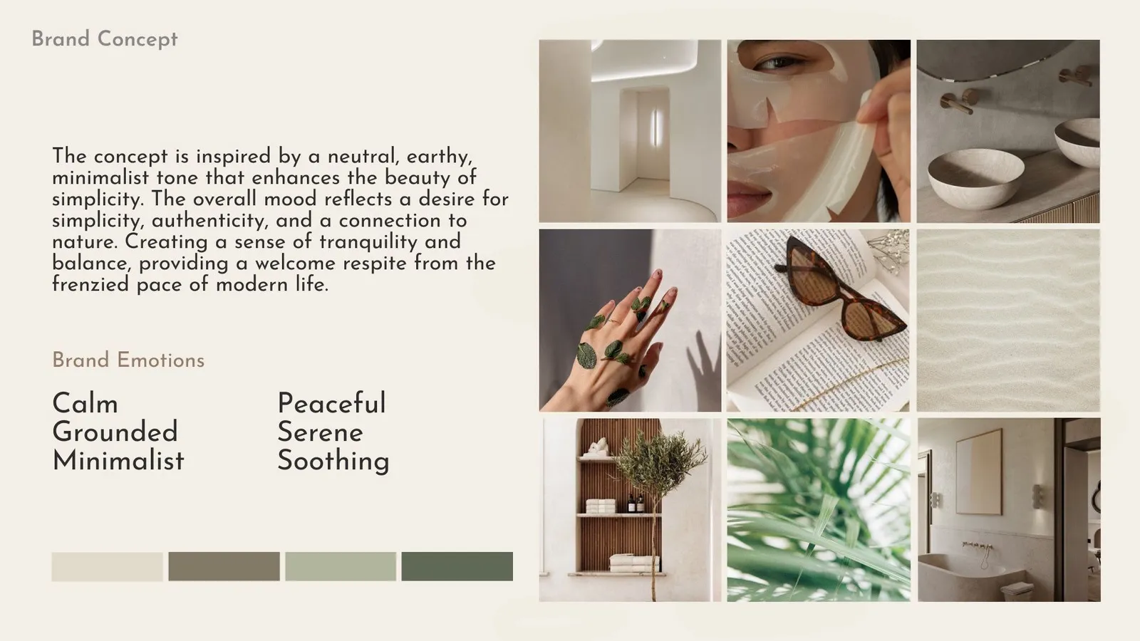
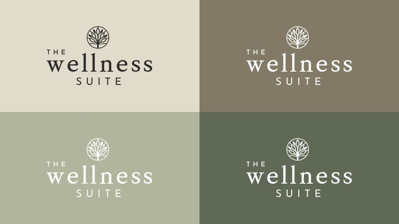
The color palette is intentionally neutral-led and muted, reinforcing a sense of calm and sophistication.
Why this approach:
-
Neutral tones create emotional balance and reduce visual noise
-
Soft contrasts support a relaxing user experience
Typography
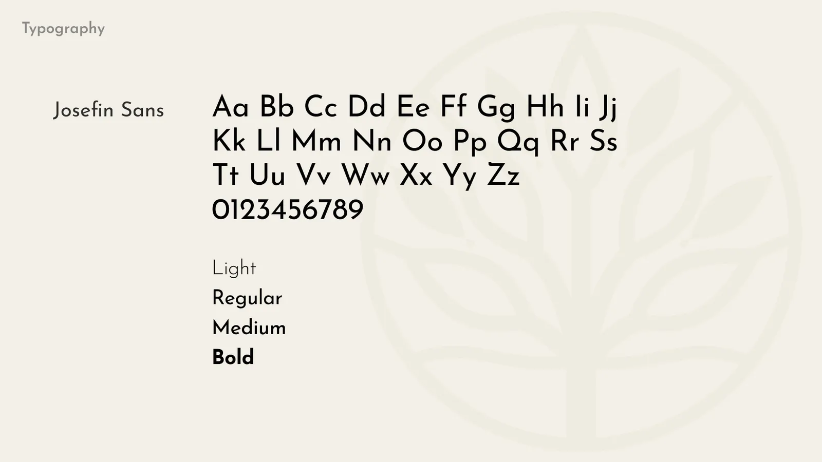
Decisions made:
-
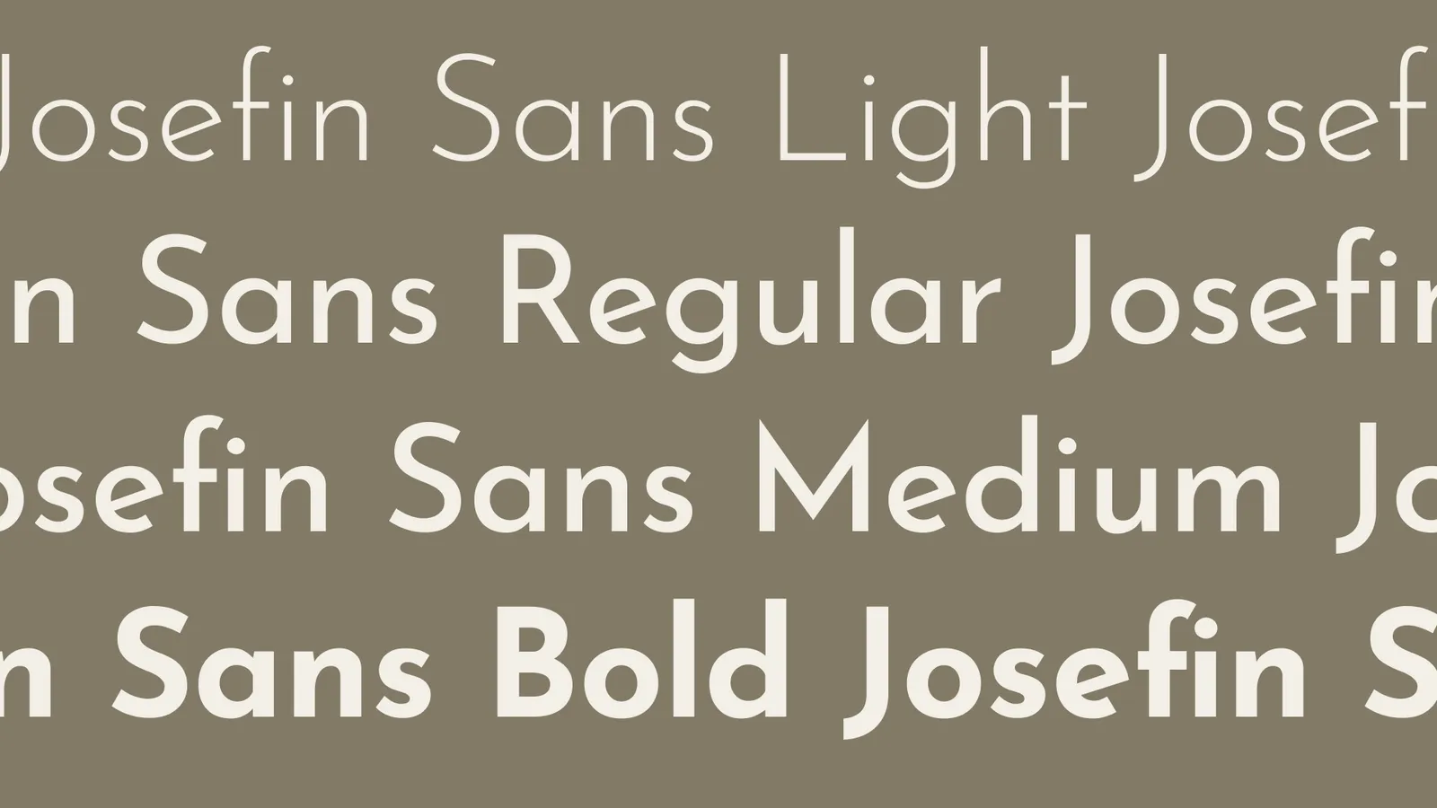
Clean, modern typefaces were selected for legibility and professionalism
-
A clear hierarchy supports ease of reading across marketing and informational content
-
The type system balances softness and structure, echoing the brand’s overall positioning
The result is typography that feels calm, confident, and highly functional.
Outcome
The final brand identity delivers:
-
A timeless, calm, and credible visual presence
-
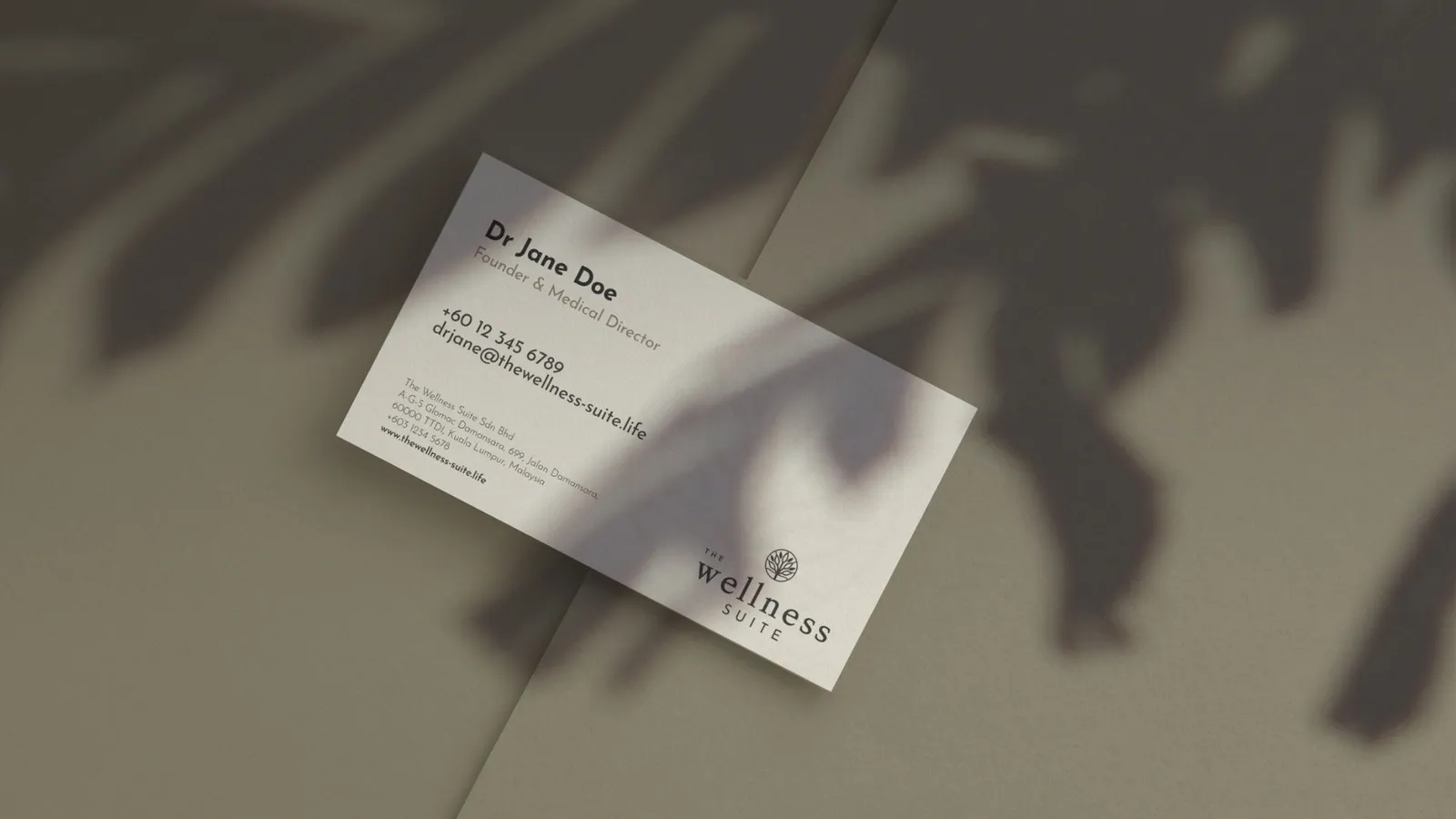
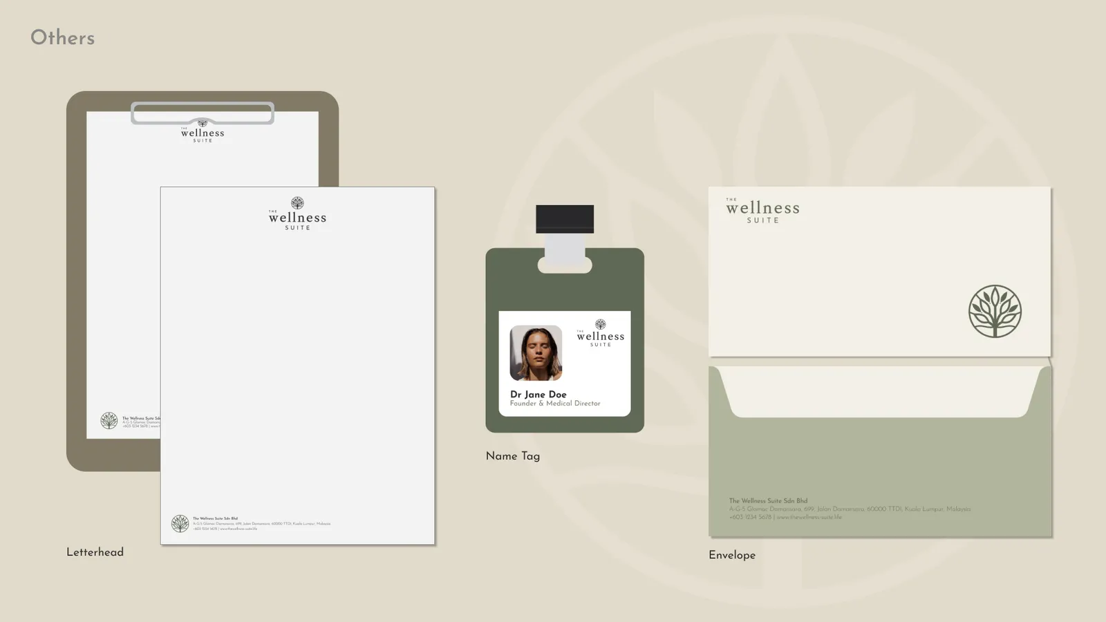
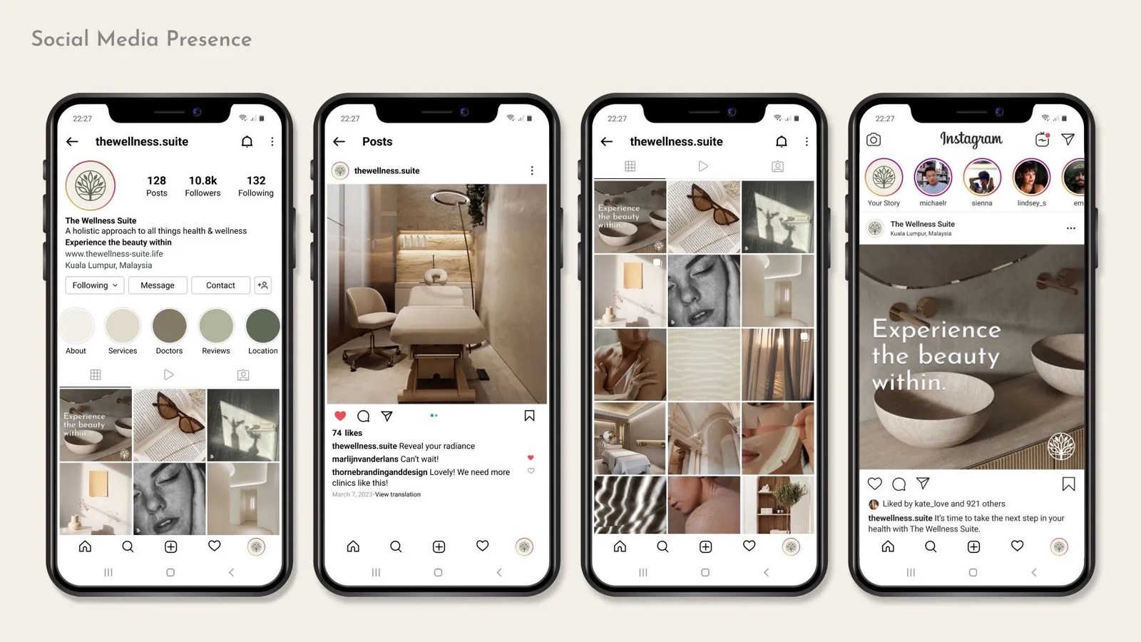
A cohesive system that works across multiple touchpoints
-
A strong foundation for future brand growth
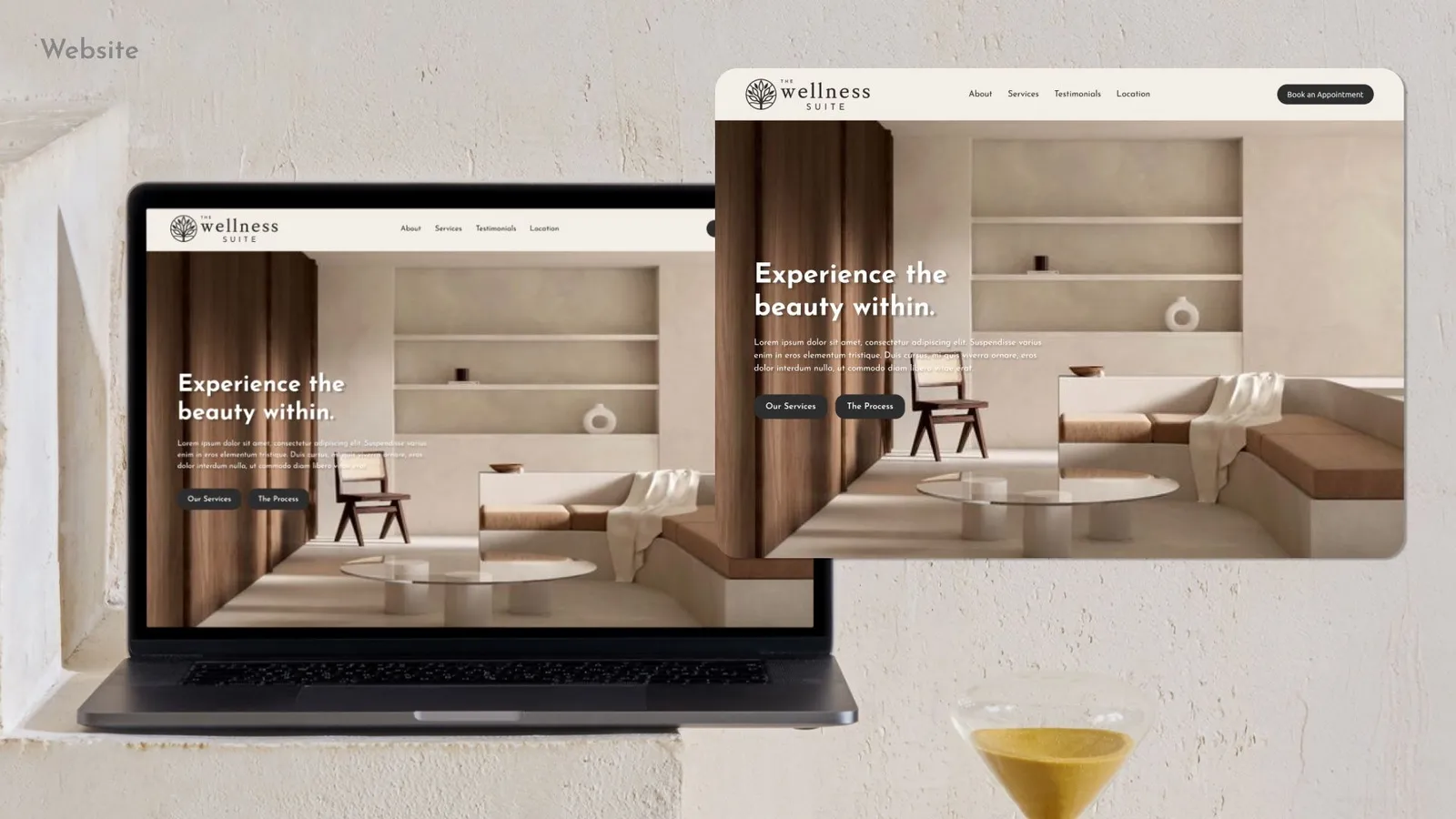
The Wellness Suite now has a visual identity that supports trust, clarity, and emotional connection — aligning seamlessly with its mission and audience.
Reflection
This project reinforced the importance of restraint in brand design. By focusing on clarity, balance, and intention, the identity avoids short-term trends and instead builds long-term brand equity.