Responsive UI Design Case Study
Practiced the full lo-fi to hi-fi UI process on a conceptual video editing platform across desktop and mobile, focusing on layout, hierarchy, and responsive fundamentals.
- When
- Oct 2023
- Type
- Tools

Overview
VidzCutz is a conceptual video editing platform designed as part of a course project. The objective was to practice the end-to-end UI design process, moving from low-fidelity wireframes to high-fidelity screens, with a focus on layout, color, typography, and responsive design fundamentals.
Design Process
Low-Fidelity Wireframes
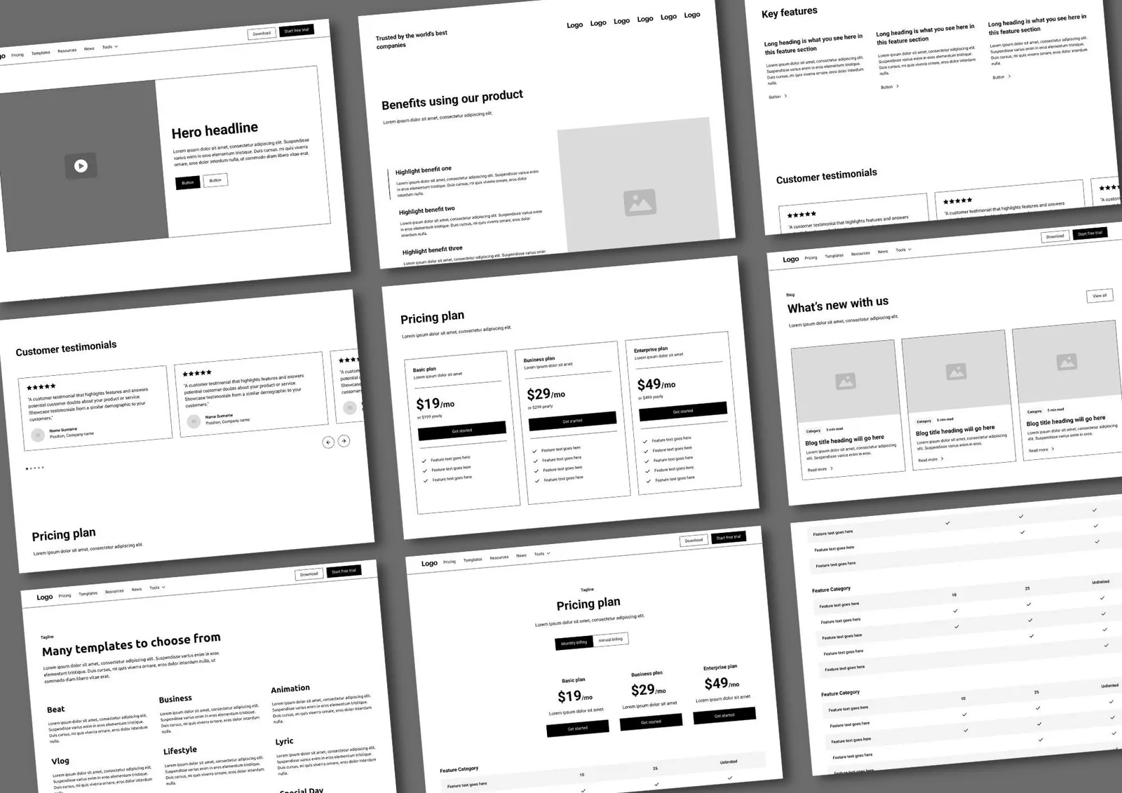
The project began with low-fidelity wireframes to define:
-
Core layouts and screen structure
-
Content hierarchy
-
Primary user actions
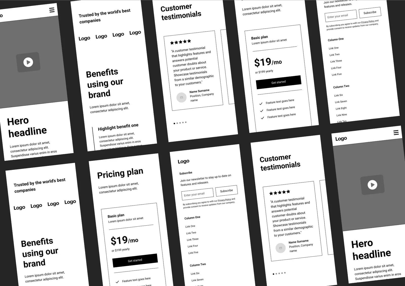
Wireframes were created for both desktop and mobile, allowing early consideration of how content would adapt across different screen sizes.
High-Fidelity UI & Responsiveness
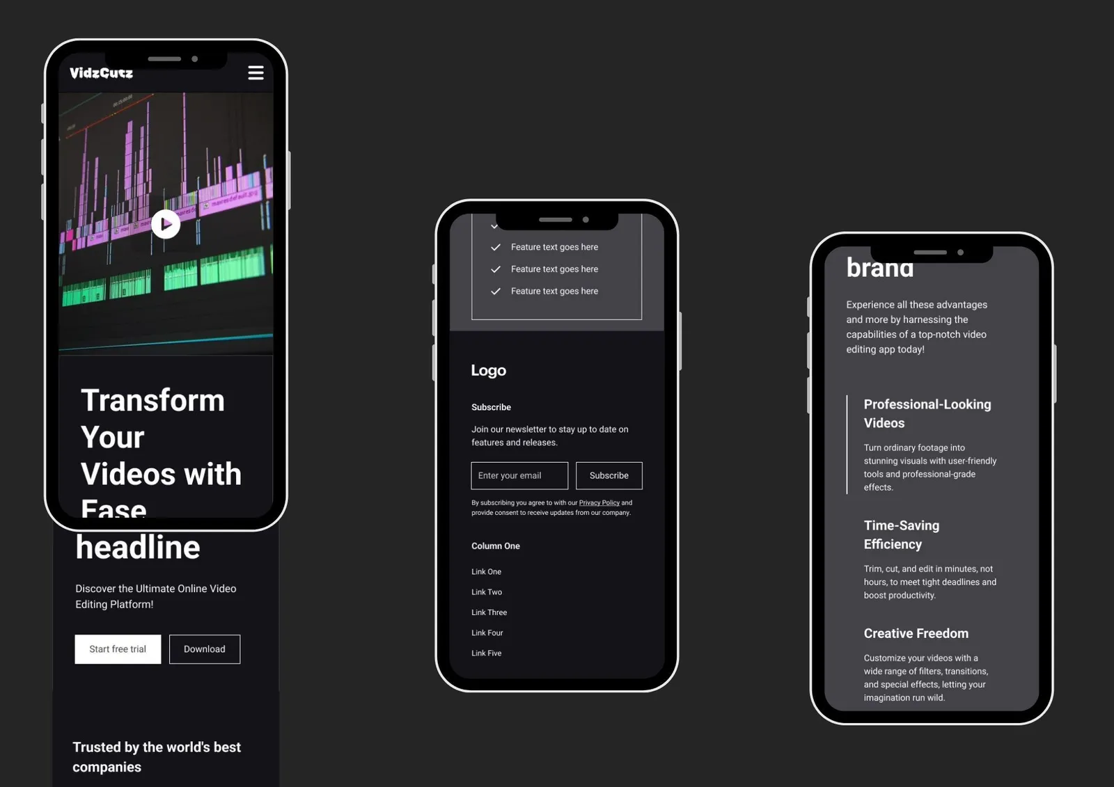
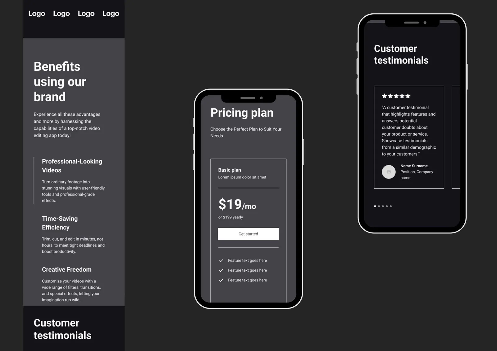
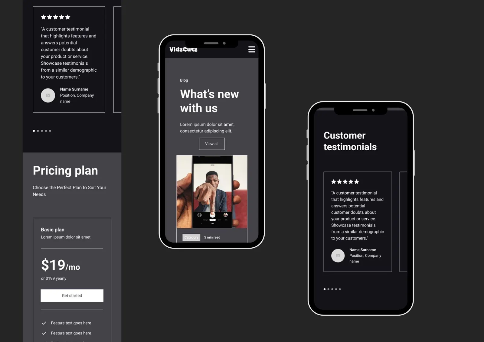
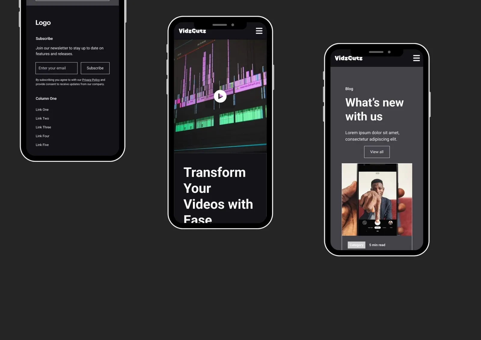
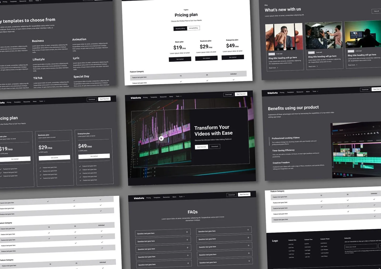
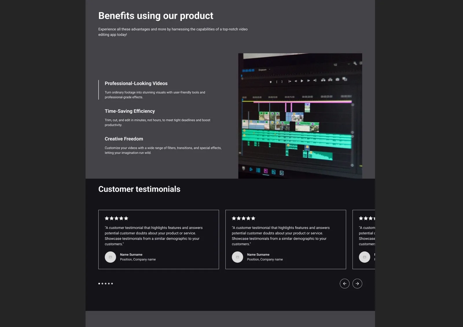
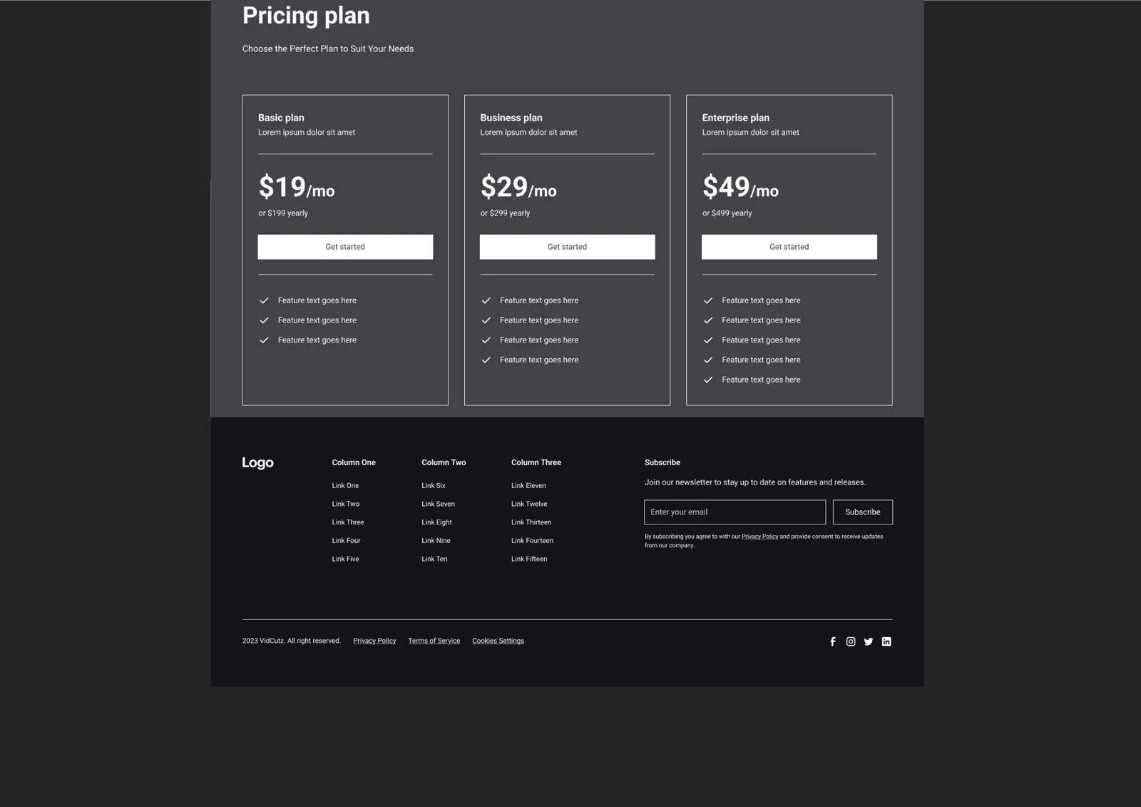
Once the structure was validated, the wireframes were translated into high-fidelity designs.
Key focus areas included:
-
Applying consistent spacing and alignment
-
Refining visual hierarchy
-
Testing responsiveness between desktop and mobile views
-
Adjusting layouts to ensure usability on smaller screens
This step helped simulate real-world product constraints and reinforced responsive design best practices.
Visual Design Decisions
Color Palette
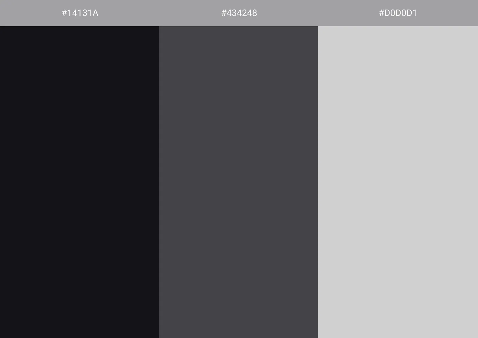
A clean, modern color palette was chosen to reflect a digital and creative tool.
-
Neutral base colors ensure readability
-
Accent colors are used to highlight key actions and interactions
-
The palette supports focus without overwhelming the user
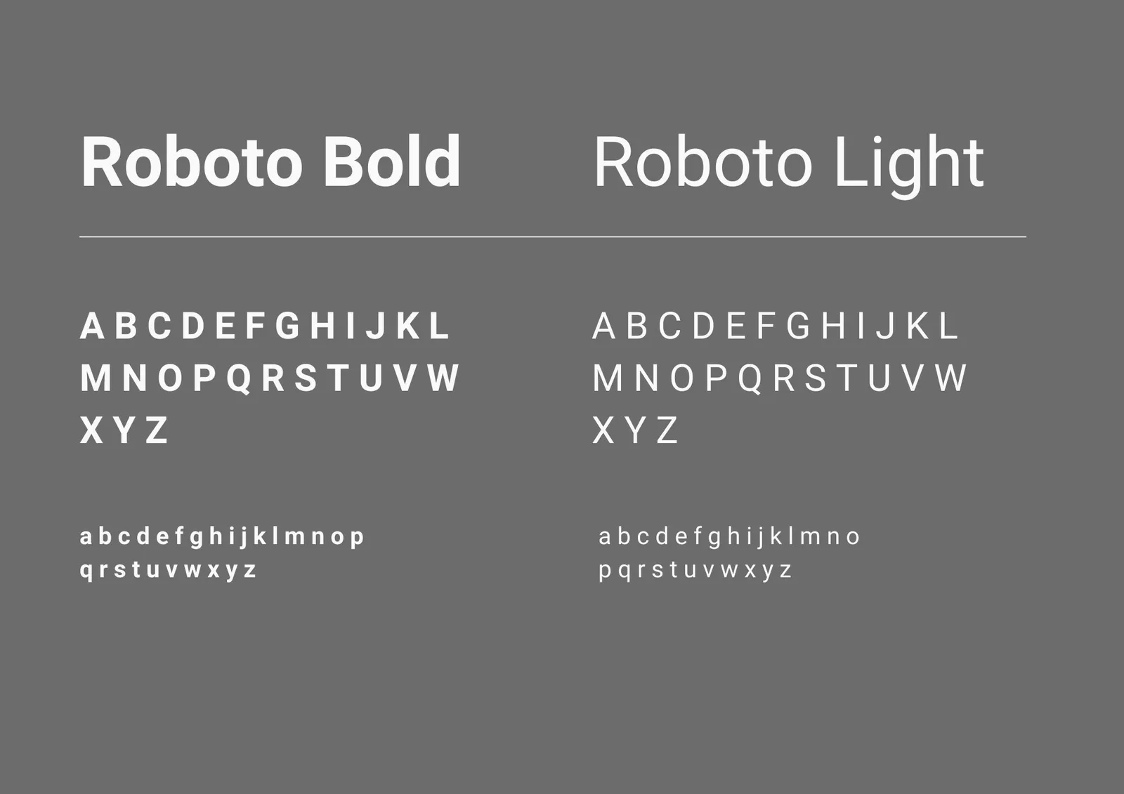
Typography
Typography was selected for clarity and legibility, especially important for a content-heavy interface.
-
Clear hierarchy between headings, body text, and UI labels
-
Simple, modern typefaces to support a digital product feel
-
Consistent usage across screens to maintain cohesion

Outcome
The final outcome demonstrates:
-
A complete Lo-Fi to Hi-Fi design workflow
-
Understanding of layout, hierarchy, and visual consistency
-
Application of color and typography principles in UI design

Reflection
This project reinforced the importance of designing with responsiveness in mind early on, and how structure and hierarchy must adapt — not just scale — across screen sizes.