UX/UI Design & Webflow Development
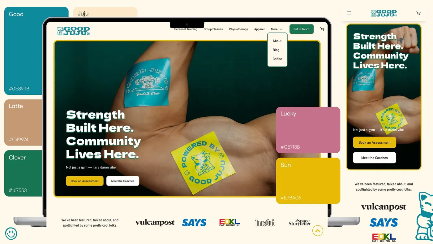
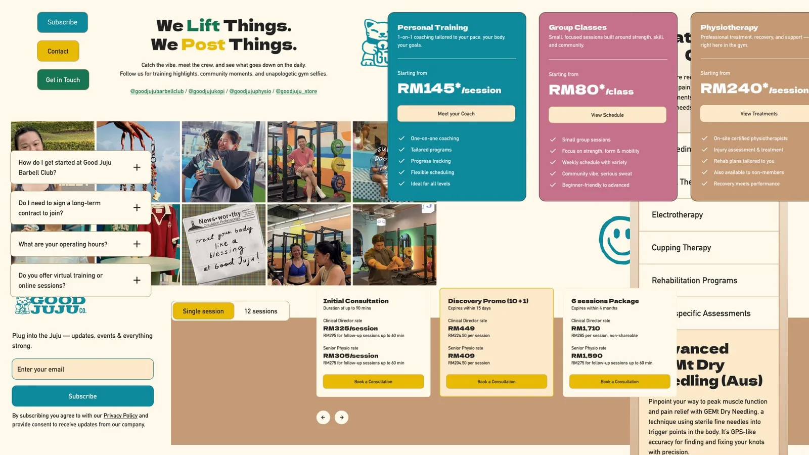
Redesigned the website for a KL fitness and lifestyle space. Rebuilt the information architecture from scratch to clearly communicate a multi-service offering, then designed and developed the full site in Webflow.
- When
- May 2025 – Sept 2025
- Type
- Tools
- Link
- www.heygoodjuju.com ↗
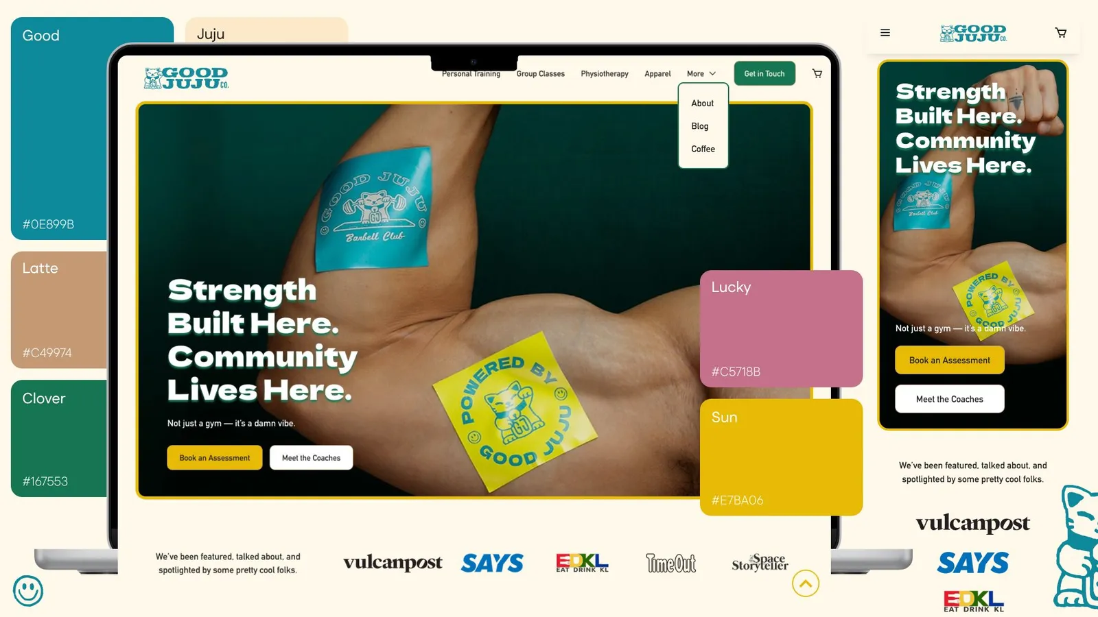
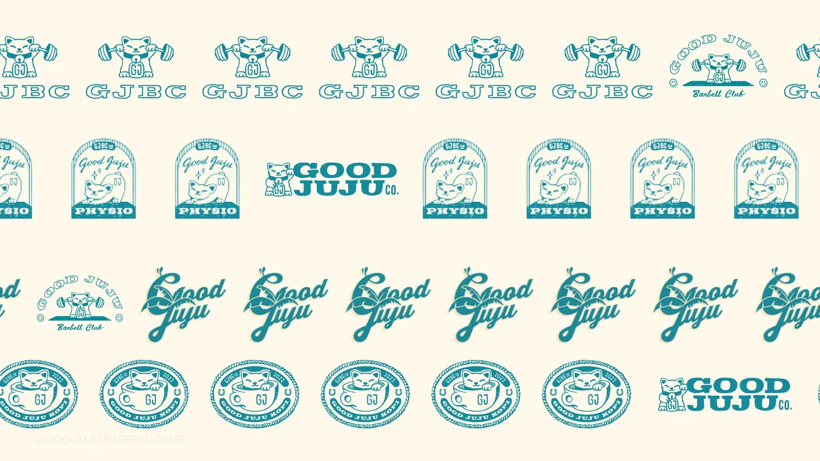
Good Juju is a fitness and lifestyle space that blends training, physiotherapy, community, and café culture under one roof. While the brand itself was already strong — with a clear personality, bold visuals, and distinctive tone — their previous website wasn’t doing the business justice.
Click to view the site → https://www.heygoodjuju.com/ ←
The Problem
Despite strong foot traffic and word-of-mouth, users visiting the site:
-
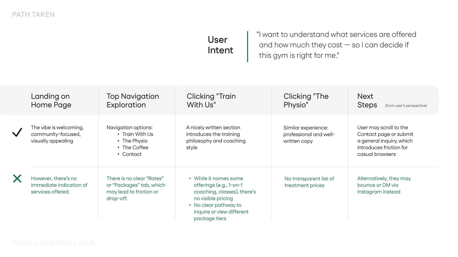
Didn’t fully understand what Good Juju offered
-
Struggled to differentiate between services (training, physio, lifestyle, café)
-
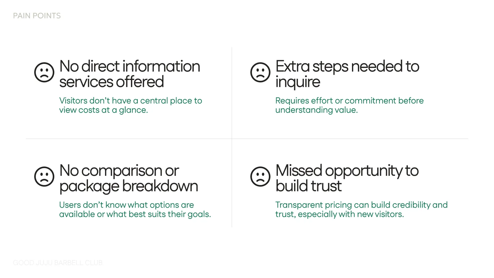
Couldn’t easily find pricing or packages
-
Dropped off before taking action due to unclear pathways
In short: the brand was compelling, but the information architecture and UX clarity were holding it back.
My Role
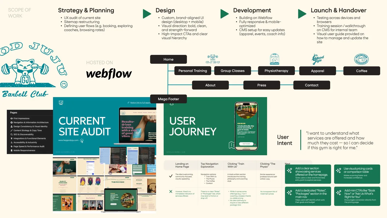
I provided end-to-end ownership of the website — from UX strategy to UI design and final build.
Scope included:
-
UX audit of the existing website
-
User persona definition
-
User flows & information architecture
-
Wireframes (low-fidelity → high-fidelity)
-
UI design
-
Website build & implementation
UX Decisions & Key Thinking
1. Starting with a UX Audit
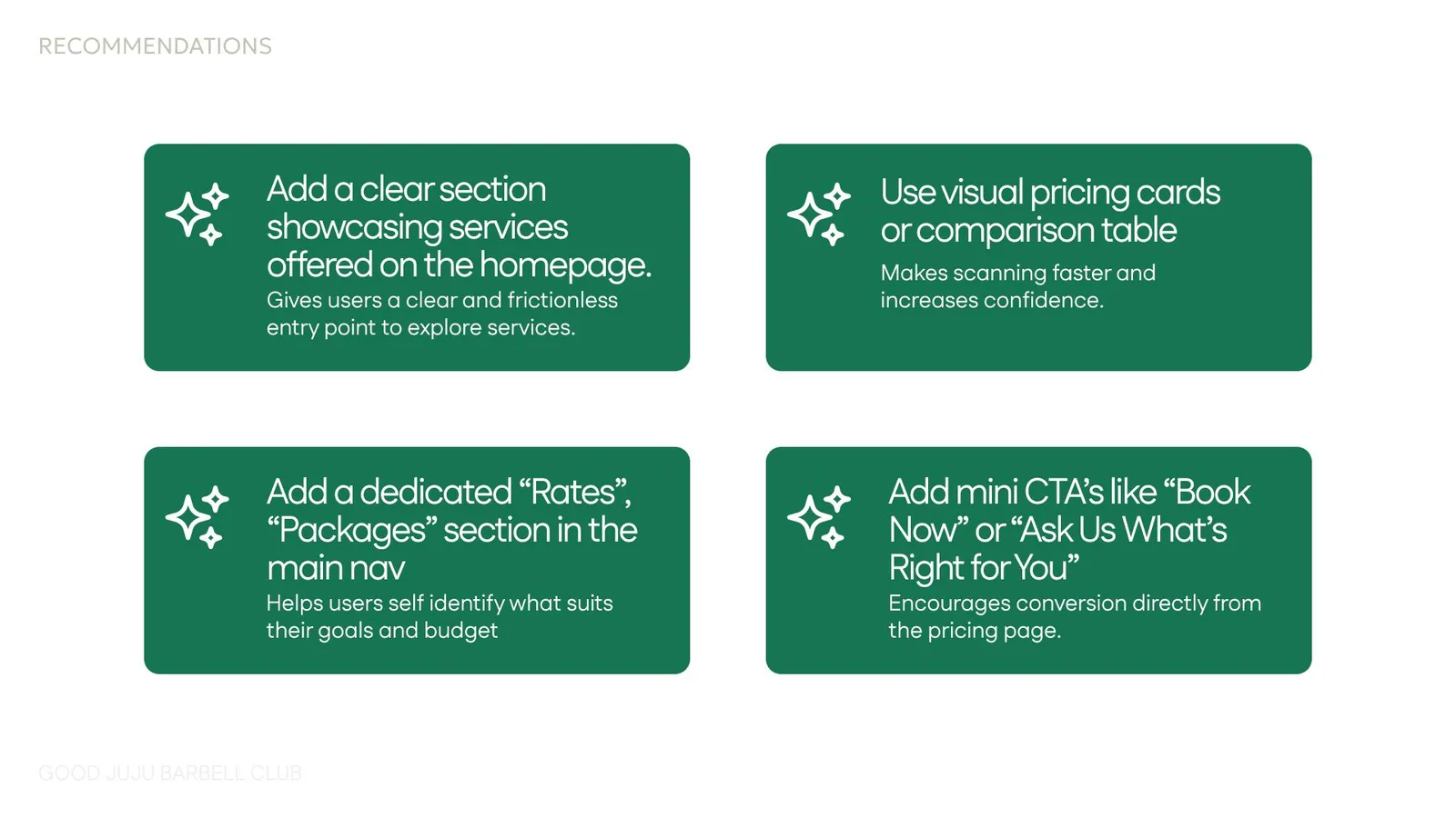
Before designing anything, I audited the existing site to identify friction points:
-
Overloaded pages with no clear hierarchy
-
Services grouped in ways that made sense internally, but not to new users
-
Pricing information buried or missing entirely
-
CTAs that didn’t clearly map to user intent
This audit became the foundation for every design decision moving forward.
2. Designing for First-Time Visitors
A core UX principle for this project was:
“If you’ve never heard of Good Juju before, can you understand them in 30 seconds?”
To solve this, I:
-
Rebuilt the site structure around user intent, not internal operations
-
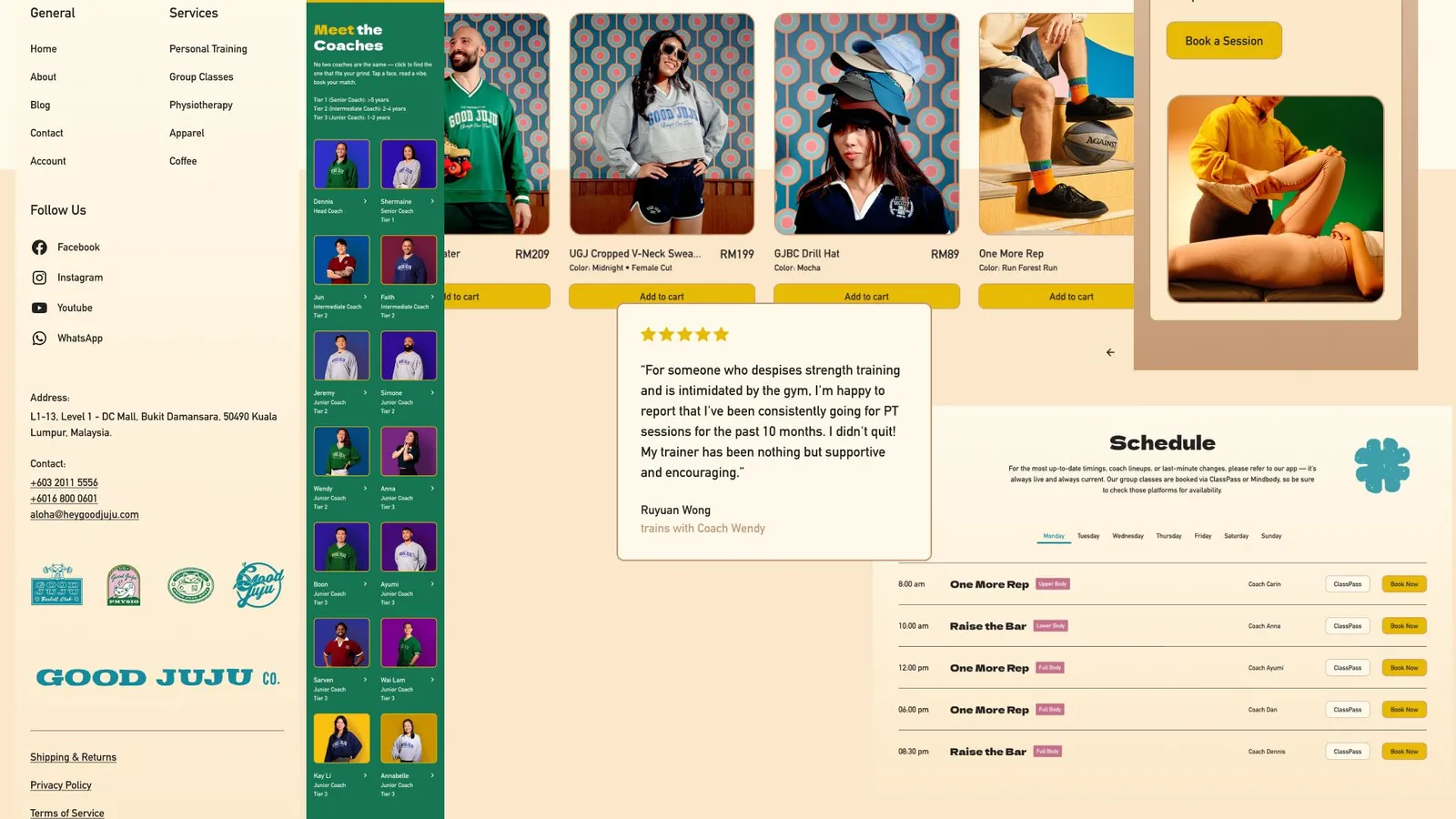
Clearly separated Trainings, Physio, Lifestyle, and Community
-
Designed user flows that guide visitors from discovery → understanding → action
-
Made pricing and packages easy to locate, reducing uncertainty and drop-off
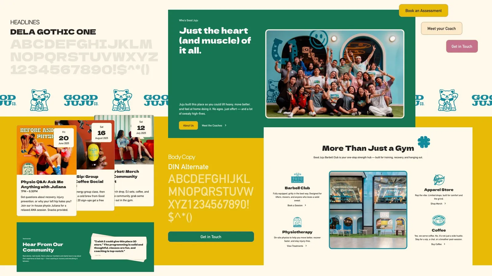
3. Respecting an Already-Strong Brand
Good Juju already had:
-
A strong logo
-
Confident colour palette
-
High-quality photography and videography
-
A clear, playful but grounded personality
Rather than reinventing the brand, my role was to translate it into a functional digital experience:
-
UI layouts were kept bold, spacious, and confident
-
Typography and spacing were used to create clarity without losing energy
-
Imagery was given room to breathe, reinforcing the community-driven vibe
-
Interactions and hierarchy supported exploration without overwhelming users
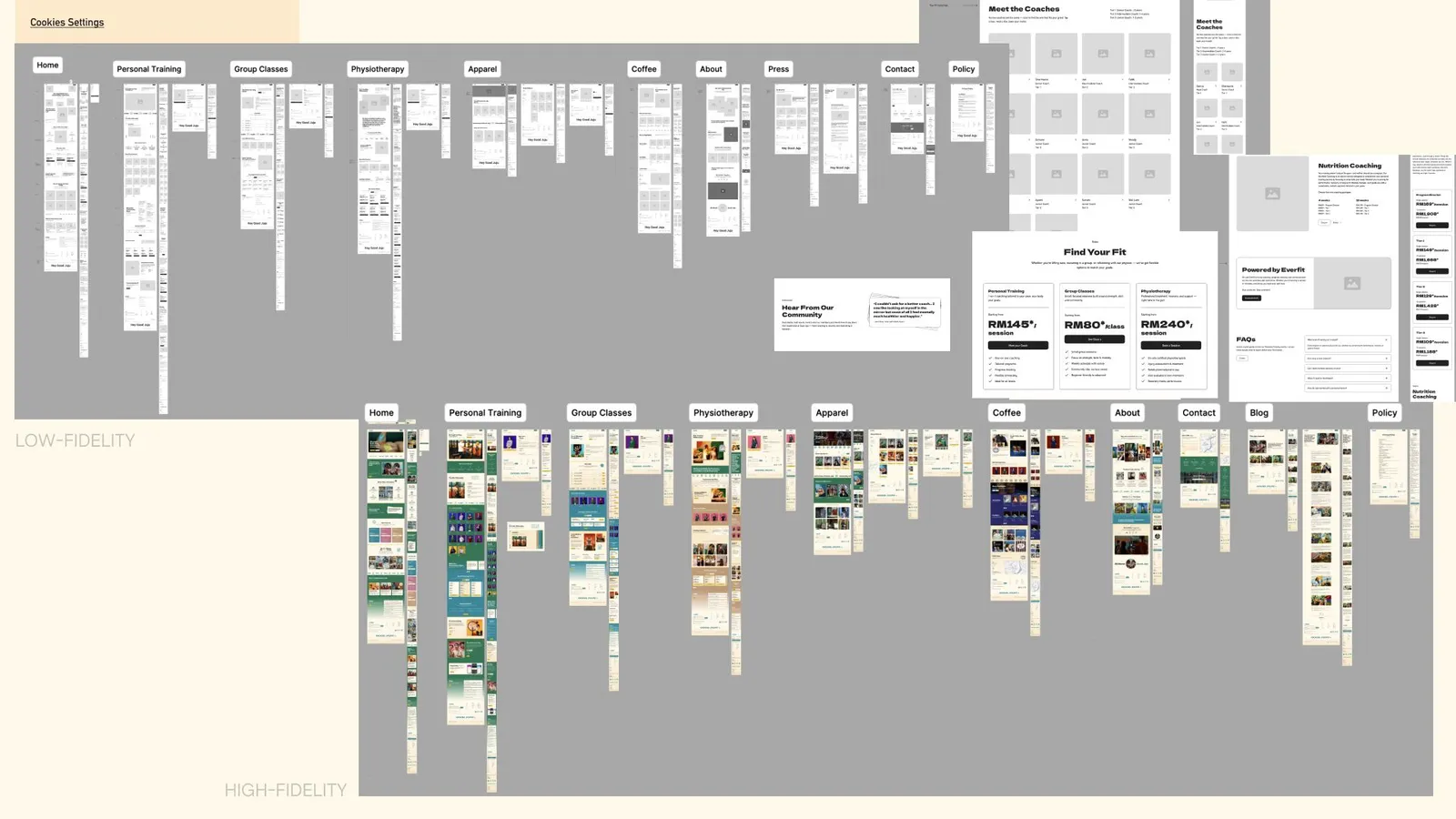
4. Wireframes → High-Fidelity UI
-
Low-fidelity wireframes focused purely on structure, hierarchy, and flow
-
High-fidelity designs layered in brand expression, visuals, and tone
-
This approach ensured UX problems were solved before visual polish
Outcome
The final website:
-
Clearly communicates Good Juju’s full range of offerings
-
Makes pricing and packages easier to find
-
Guides users confidently toward training, physio, or contact
-
Feels aligned with the brand’s personality — bold, welcoming, and community-first
Most importantly, the client was extremely happy with the outcome, feeling the website finally reflected who they are offline — but in a clear, user-friendly way online.
Key Takeaway
This project reinforced that great branding alone isn’t enough.
When strong visual identity is paired with thoughtful UX strategy, the result is a website that not only looks good — but actually works.
Personal Training, Physiotherapy, Group Training in KL | Good Juju Barbell Club ↗